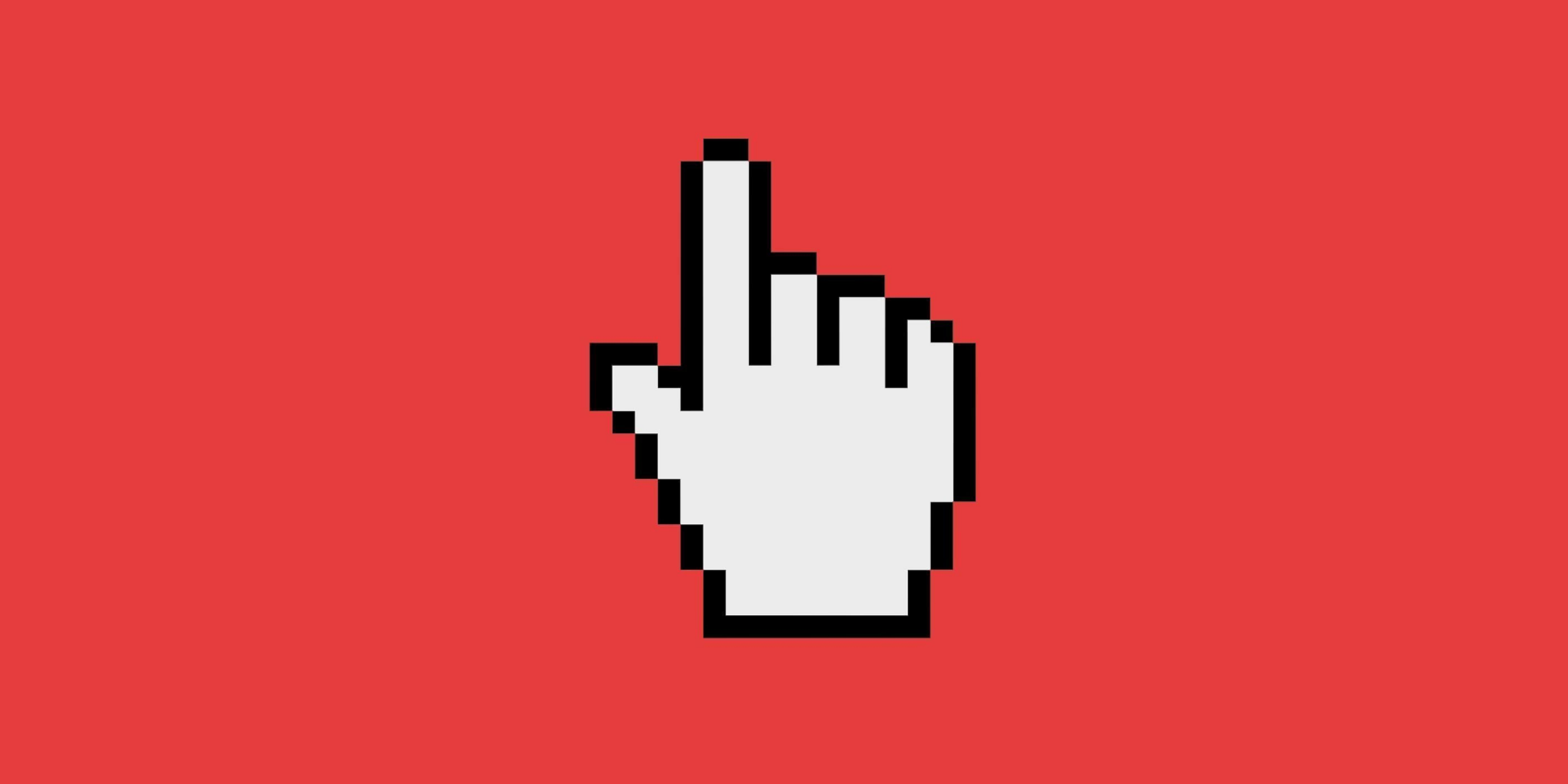
There is this belief that the hand cursor means “clickable”, but this is incorrect and potentially problematic. My hope is that by the end of the article, you’ll never want to use the hand cursor for buttons ever again.
The hand does not mean clickable
It’s no accident that browsers don’t give buttons (and other elements) a hand cursor —it’s because they’re not meant to. Take a look at the following screenshot:

Chrome on Mac OS
Almost every element is interactive and clickable — the menu, the tabs, the whitespace, the browser buttons, the bookmark bar and Google’s search box — but, none of them have a hand cursor.
There are more interactive and clickable elements not shown above— select menus, sliders, checkboxes, radios, labels, images, empty space (e.g right click — view source) and text —again, none of them have a hand cursor.
The same goes for any computer you have ever used. You can tap, drag, select, press, left click and right click on a plethora of different elements including buttons. However, buttons are not afforded by a hand cursor displaying on hover.

“License Agreement” is a link and uses the hand cursor. The buttons don’t.
Affordance is provided by the way something looks regardless of the cursor. Remember, the cursor is only available when hovering with a pointing device such as a mouse.
This is why, for example, checkboxes are never round (and radios are never square). This is also why links are typically underlined. This is why links do, in fact, have a hand cursor.
What the authorities say
Microsoft’s design guides talk about weak affordance:
"Text and graphics links use a hand […] pointer […] because of their weak affordance. While links may have other visual clues to indicate that they are links (such as underlines and special placement), displaying the hand pointer on hover is the definitive indication of a link."
To avoid confusion, it is imperative not to use the hand pointer for other purposes. For example, command buttons already have a strong affordance, so they don’t need a hand pointer. The hand pointer must mean “this target is a link” and nothing else.
Apple’s Human Interface Guidelines states that the hand cursor should be used when “the content is a URL link”. W3C User Interface guidelines says the same thing again with “The cursor is a pointer that indicates a link”.
The hand cursor is for links
The hand (and often underlined text) signifies a link. Links are not buttons. Links came along with the web. To help users understand that they are different, they are given the hand cursor. It serves as an extra clue. Here’s why:
- Clicking a link opens a web page or resource.
- (On desktop) I can right-click on a link and do many things (that I can’t do with a button). Open in new tab/window, save a link, copy address, add to reading list, bookmark it and more.
- (On mobile devices) I can tap and hold on a link and get a similar context menu as per the previous point.
- A link also tells me that I am just going somewhere else. I am not modifying any data or making changes in anyway (like a button is likely to do).
Summary
When a button has the hand cursor, it subtly suggests that the user is interacting with a link when they’re not. If you want to give visual feedback when the user hovers, you can do so with other style changes such as background colour.
"A well-designed button does not need a hand cursor to help the user realise it does something."
The hand cursor is reserved for links. This is because they are unique in their behaviour. Browsers and Operating Systems have done the work for you — because contrary to popular belief — browsers know best.
Links have always been handled this way since the web came along — this is the convention of the web that you need not innovate on. You can rest easy knowing that browsers have you covered. This leaves you and your team to solve real problems.
"By the way, because forms are such an important part of the web, I am writing an entire book about how to design and build them. If you want me to let you know when it’s finished subscribe here and I will keep you posted. Thank you."
This article was originally published on Adam's Medium page.