
Today’s article is about understanding what is aesthetic design and its importance for the perception of usability. Humans like pretty and shiny design; they desire it much more than functional one.
We enjoy looking and using aesthetically pleasing design, because it satisfies our senses, it gives us pleasure.
Designers tend to think of aesthetics as the visuals of the design. However, aesthetic design consists of more elements than just how it looks.
What is aesthetic design?
There is a whole branch of philosophy exploring aesthetics. Let’s scratch the surface of the Aesthetics field and learn how it relates to our design work.
There is a phenomenon that social psychologists call “the halo effect”. It means humans tend to assume that good-looking people have other positive qualities aside from their looks.
The same is valid for product design. Good looking products and user interface are perceived as more valuable and having more qualities.
“Beauty is in the eye of the beholder”. Aesthetics are in all our senses, not just the sight. Aesthetic design is a 4D experience. Product designers, who are doing actual physical products are aware of that.
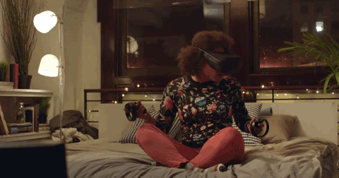
With the emergence of VR and AR technologies it becomes more important for digital designers to consider the 4D experience too.
There are 4 important categories, which can make or break the aesthetics of our designs.
Vision:
The most dominant sense in majority of people is our sight. We can’t stop ourselves to look at what we find beautiful. It is as if the light that reflects from the beautiful design acts as a magnet for our eyes.
Visual aesthetics have these key elements: Color, Shape, Pattern, Line, Texture, Visual weight, Balance, Scale, Proximity and Movement. Using these element well will help us achieve good visual aesthetics.
Hearing:
Our ears are capable of perceiving a whole another level of aesthetic design. The ability to hear how your car engine works, how the digital product notifies you of new messages and etc. This is the power of sound aesthetics.
Sound aesthetics have these key elements: Loudness, Pitch, Beat, Repetition, Melody, Pattern and Noise. Using them well will create enjoyable “music” for our users.
Touch:
Skin is the largest organ in human body. It also helps us experience the aesthetics. Material aesthetics are especially important for physical products.
Just remember, the last time you were buying cloths and feeling their texture or when you were checking out the latest mobile phone and feeling the frame material. Sometimes people make there buying decisions only based on the material aesthetics. Powerful stuff are these material aesthetics.
Material aesthetics key elements are: Texture, Shape, Weight, Comfort, Temperature, Vibration and Sharpness. By mastering them we can make our customers adore our products.
Taste and Smell:
Taste and Smell are sense that help us experience aesthetics even more deeply. Especially in food industry and different environment designs, these senses play an important role in experiencing aesthetics.
Key elements are: Strength, Sweetness, Sourness and Texture (for taste). Use these elements when possible to enhance the full picture, so our users can feel the aesthetics even deeper.
Now that we know a bit more about aesthetic design, let’s look at why it matters.
Why aesthetic design matters?
Not long ago user were expecting only functional and usable products when they were buying. Today, users expectations have evolved together with the design field.
People expect usability by default and are seeking products that are more than functional and usable. We want to experience pleasure, to stimulate our senses. We want the products we use to evoke positive emotion in us. Aesthetic design is crucial to satisfy these needs.
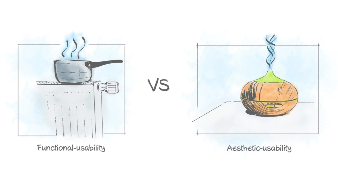
We all judge the book by its cover. The better the book cover the more we believe the content is better. This is phenomenon called “Aesthetic-usability”. Beautiful products/objects are perceived as easier to use and more valuable than ugly ones. Even if it is not true!
This phenomenon is especially valid when the products compared are equal in functionality and ease of use. The better looking product will win over the users swiftly.
Aesthetically pleasing designs are bringing up positive attitude in the users. It makes them care more about the product. Aesthetic design makes people more loyal of the brand and tolerant toward mistakes or failures. Imagine all the apple fans.
Early impressions of a product design matter! Aesthetic design is influencing how people think and feel. It influences how much pleasure we feel from the product. Aesthetic design affects our long-term attitude about products and even people.
Aesthetic design matters not only to make the first impression, but also to keep strengthening the bond with the user. The design of our products needs to be aesthetically pleasing consistently across the whole product and user journey.
Design for aesthetic pleasure
Let’s see how the words above can be useful for us to make better design. We have to design products that deliver pleasure to the user with aesthetics and usability.
But when aesthetics are in the senses of our users, how do we know what to design? The answer can be given by the people we’re designing the product/experience for. We need to understand them before deciding what is aesthetically pleasing.
When we are designing products for really wide audience it is wiser to keep things simple as much as possible!
There are 4 important pleasure aspect that we need to consider when we want to make our designs aesthetically pleasing.
Psychical pleasure
Pleasure derived mostly from touch, smell and taste. Think of designing hand-held product, computer devices, VR set even a normal pen.
We need to make sure the design is ergonomic, it feels comfortable and doesn’t overload the user senses. Consider how sensitive are your user’s senses, what is the average norm. Make sure the smell and taste is either neutral or brings positive associations.
Social pleasure
Pleasure derived from interacting with other people or with AI(still not that common). This context is very broad it can be from home assistant device and VR experiences to a room/building where social events will be hosted.
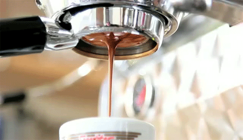
We need to make sure the design supports social interaction in the best way possible. It could be as simple as the sound aesthetics of the coffee machine that allows employees to communicate while waiting for the coffee to be ready.
Psychological pleasure
Pleasure derived from completing a task or feeling in control and safe. This context is very tightly related to the usability of the product. But it can be also related to how the product design looks.
For example, a solid and stable looking car gives more psychological comfort than one that seems it might break if you open the door. Same is valid for digital products where the user feels in control and knows the task can be completed for sure.
Making things look and feel simple and stable. Guiding the user with great composition and motion. Using aesthetics plays a big role in making the users feel safe and in control.
Ideological pleasure
This context is mostly about abstract pleasure. I like to think of it as the glue that binds the other pleasure types. It is the meaning of the words in the books not the colors, font sizes and page layouts.
For example, in product design taking the sustainability angle can trigger pleasure in the user, making her feel well because she is responsible for the environment. Here are a 5 startups that are using that context.
We need to make sure that our designs communicate ideas and deeper meaning. This can frequently result in very deep aesthetically pleasure once the user realizes it.
Balancing aesthetics and usability
There are cases where we need to sacrifice aesthetics, due to different limitations depending on the context. Other times aesthetics could dominate the usability aspect.
Aesthetics and usability in balance
This is what most of the cases as Designers we should strive to achieve in our designs. There are many good examples from smart phones and apps to computer chairs that look and feel good, but also have the desired usability.
Aesthetics over usability
Some times products have dominating aesthetics that are not supported by good usability and ergonomics. This is mostly visible in the fashion industry.

I guess these might be nice in winter time :)
Shoes made to look nice and attractive, while at the same time destroying the feet of the user. This demonstrates clearly how humans can be seduced by aesthetic design and even at the price of their health.
Usability over aesthetics
Other times usability must be in focus no matter what. Equipment designed for emergency situations, where people cognition is compromised. In this cases, aesthetics are with low priority. When designing for such cases there are a lot of constraints from different authorities and requirements. Using Hick’s law for quick decision making can help you make the better design decisions using web design software.
Final thoughts
First impression matters. When we perceive beauty with more of our senses we feel deeper pleasure from the design. Aesthetic design gives users pleasure from the start! It makes them form a bond with the design, bond that goes beyond the initial interaction.
Aesthetic design is perceived as more friendly, usable and valuable.

