This week’s design principle is focusing on Hick’s Law, which is related to the KISS principle. Let’s first say a few words to introduce Hick’s Law.
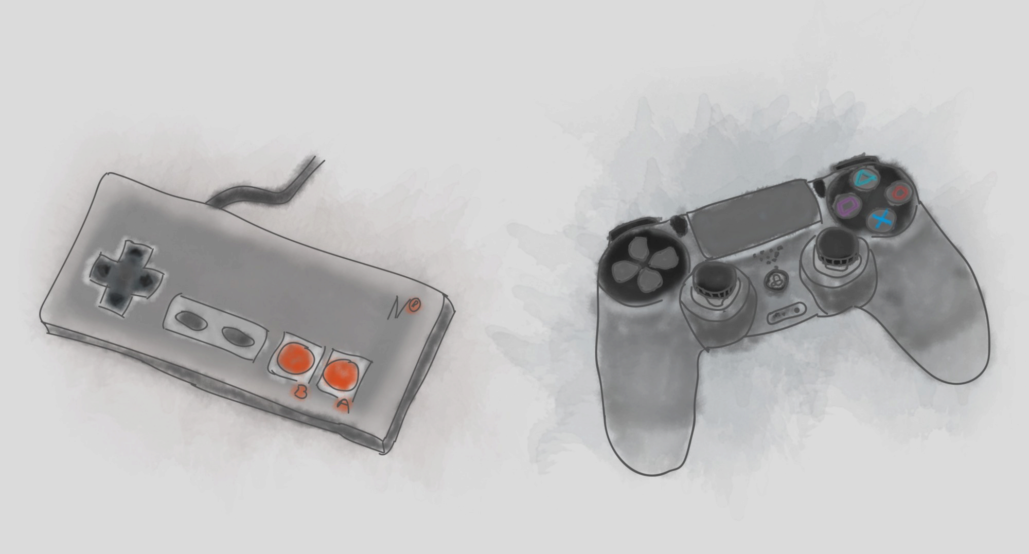
Do you remember the old video games from before 20 years and how much fun it was to play them. The controls were so simple you could learn to play in seconds. For example, Super Mario with just left, right and jump controls.

The good old times :)
In comparison, today’s input controls of modern gaming consoles and PC games are offering so many choices and combinations. All these controls, multiply the options user can choose in any certain situation.

Modern MMORPG (much more difficult to learn and play)
Having so many options makes learning the game and enjoying it much harder and time consuming. One of the reasons is explained by Hick’s Law.
Hick’s Law predicts that the time and the effort it takes to make a decision, increases with the number of options.

"Hick’s law, or the Hick–Hyman Law, named after British and American psychologists William Edmund Hick and Ray Hyman, describes the time it takes for a person to make a decision as a result of the possible choices he or she has: increasing the number of choices will increase the decision time logarithmically."
So, the time it takes a user to finish their task increases with the number of available options. We can shorten this to: Less is Faster (easier to remember)
When to use Hick’s law?
Use Hick’s Law when response times are critical. It applies to any simple decision making with multiple options. This is especially important in control system environments.

If the nuclear reactor is overheating you wouldn’t want the user to search for the manual.
When things go wrong and alarms are triggered users need to be able to make quick decisions. When users enter the stress zone they get tunnel vision. If you combine that with the input from all the body senses, you can get a pretty nasty situation.

Having one choice acts as light in the tunnel when users are stressed or confused.
When response time is critical keep the choices to a minimum. It will speed up the decision making.
What about normal everyday situations and products?
Hick’s law can be used to narrow down big volumes of information without overloading the user.
"When you need to simplify complex process, use Hick’s law."
When you need to simplify complex process, use Hick’s law. Present specific parts of that process at any one time on the screen.
An example can be a payment process. Instead of showing everything at once, you can break it down. Show the screen with shopping cart details then another with delivery information, then optional account creation and so on.

Amazon’s 1-click buy is a great example of Hick’s law and KISS application.
Reducing the number of perceived options on screen makes the interface more user friendly. It is also more likely that the user will accomplish the goal and not give up or get confused.
It is important to point out not to oversimplify! Breaking down choices to a series of too many small chunks can also cause the user to drop off before reaching the goal.
A way to get started with Hick’s law
Card-sorting is a great method to find out about the categories of information that make more sense to your users. It will help you define the groupings of functionalities and terms. You can use old-fashioned paper cards and human interaction or digital tools for distant card sorting. Tools like Optimal Workshop or similar, can be very efficient and quick to get actionable results.
"Reducing the number of perceived options on screen makes the interface more user friendly."
When not to use Hick’s law?
It’s equally important to know when not to use it. Hick’s Law does not apply to complex decision making. If decisions are requiring extensive reading, researching, or extended deliberation. Hick’s Law won’t be able to predict the time to make a decision.
For example, choosing a dinner at a fancy restaurant or picking an AirBnB place to stay for your vacation next week.
These type of choices are complex. Users need to consider and weight many options before making the final decision. In these cases, Hick’s Law prediction will fail. It only applies to simple quick decisions in appropriate context.
Practical use of Hick’s Law
When response time is critical, keep the number of options small. One to five is a good rule of thumb.
Humans are strange. We like to say we want as much options as possible. When we get them…we get confused and can’t take a decision.

Don’t you want to use all these buttons?
Having too many options with equally perceived hierarchy can cause analysis paralysis. Yeah, that leads to feeling frustration. Not the best user experience.
"Having too many options with equally perceived hierarchy can cause analysis paralysis."
In contrast, system with less and clearer options frequently are rated from users as having better user experience.

Complexity is hidden for when it is needed
Highlighting is another way to use Hick’s Law. Make a few important options to stand out among cluttered user interface to speed up the response times.
In decision-making context aim at reducing distractions. Having distractions can act like having more choices. This leads to slow response time.
Is Hick’s Law affecting my design?
Here are a couple of ways to see if applying this design principle has effect on your design. We always have to look at metrics to confirm that our design decisions have effect.
Look at time spent on site
You have to hit the sweet spot. On one hand, if the user spends too little time, they probably left without making a decision. On the other hand, if the user spends too much time, they probably got distracted from the goal.
Focus on optimizing the design to provide the user with the right amount of options to keep the engagement. Help the user to make the choices and convert.
Look at page views
The number of page views can also be indicator for how effectively you’ve used Hick’s Law. If the navigation is too complex, the number of page views is likely to be lower than if it was simple.
That said, avoid creating deep navigation that requires 2–3 choices for each level and continues for 10 levels. This will increase the time for completing a task, which will increase the likelihood of users leaving the site prematurely.
Final thoughts
User’s time is precious! Time = Life. Don’t allow bad design decisions to steal life from your users. Nobody is obligated to stay or use your product (especially when there are alternatives).
"Don’t allow bad design decisions to steal life from your users. Nobody is obligated to stay or use your product."
Get to know the user, interact with them. Guide the user toward their goal by highlighting the choices they care about in that context. This will optimize the decision making and speed up the completion of the task. In the end, both sides will be happy.
This article was originally published on Anton's Medium page.

