After the overwhelmingly positive interest in my Designing Data-Driven Interfaces
article, I decided to write about this related and equally important topic: managing complexity.
You know that unsettling feeling when you’re half way through a project and you’re presenting design concepts? No major feedback, smiles across the table, heads nodding yes. Home run right? No, that feeling scares the shit out of me because you know there’s complexity lurking below and it will surface before you’re done solving the problem. If you don’t overcome it can crush your productivity and even kill the product before it sees the light of day.
"Complexity in product design tends to rear its head in two ways; the complexity of managing people and opinions and the complexity of designing the product itself."
Complexity in product design tends to rear its head in two ways 1) the complexity of managing people and opinions. And 2) the complexity of designing the product itself. It’s not always intuitive how to keep your head above water in a sea of features, users and stakeholders. I’ve certainly fallen on my face in the past, so I’d like to share some insights I’ve gleaned about tackling these big design projects.

Change the conversation
I’ll start here, since this is an over-arching theme for managing any design project. As designers we too often inherit projects or requirements and accept them as-is. We try to do a good job with the little information we have then get frustrated later when pressured to change the design to address changing constraints.
"Part of why designing products is hard is because they represent high-stakes environments and there are a lot of opinions in the mix."
"It’s our responsibility as designers to change the conversation."
Part of why designing products is hard is because they represent high-stakes environments and there are a lot of opinions in the mix. Sadly, a design voice isn’t always part of that mix. It’s natural to blame the business, but the one you should blame is yourself.
"It’s our responsibility as designers to change the conversation. We need to educate our clients, bosses and teams on how to be successful in a design process."
This is hard: sometimes I feel like our design sermon falls on deaf ears. There’s no silver bullet, but here are some techniques that help.
"Sometimes I feel like our design sermon falls on deaf ears."
Show them where they’re going, before you take them there
At the outset of a project I present stakeholders with a peek at our design process. I walk everyone through each major stage and show sample deliverables of what to expect. Then at various points in the project, I remind everyone where we are and where we’re going next.
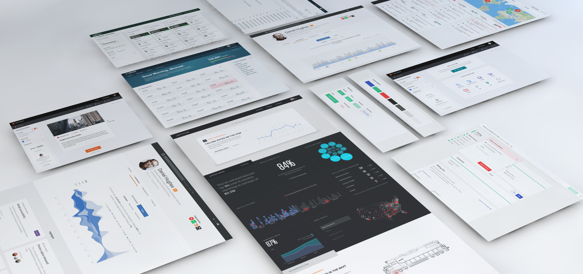
-

- Sample process and deliverables timeline.

In addition to explaining the process, I think it’s important to explain what types of feedback I expect and when I expect it. Sometimes I even explain how and why feedback is essential. That way it’s clear that both sides have a responsibility to make the design successful.
Talk to the boss
Whenever we start a new design project I ask to meet with the “boss”. Usually it’s the CEO, or most senior person I can get access to. I like to hear the vision and expected outcomes straight from the source.
I take copious notes and try to capture the sentiment and “voice” of what’s being said. Then I re-use the same language later when advocating for design decisions. This has served me well, because nobody wants to argue with the boss ????
When things get confusing, and they often do, I try to re-align with what I heard in that original meeting. As design practitioners it’s our job to translate the company vision into elegant solutions. There’s nothing better than the voice of the leadership to help remind you of the bigger picture.
"As design practitioners it’s our job to translate the company vision into elegant solutions."
Empathize!
As a part of the discovery phase we typically gather executives and key stakeholders into a room to tell us about their customers. The goal is to get stakeholders to let their guards down, take a step back and think about the product from an empathetic perspective.
"The goal is to get stakeholders to let their guards down."
We use a tactic called an empathy map to facilitate the discussion. The premise is simple, ask your stakeholders what their customers are thinking, doing, saying, hearing and feeling then map it to a persona. We typically do this for 2–3 key personas scoped to a specific time or interaction in the product.
-

- Smattering of empathy maps from office parks around the country.
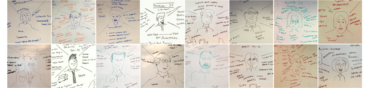
After using this technique on a few projects we noticed consistent (and surprising) feedback— “That was the first time we’ve had all the executives in a room talking about our customers. It was really insightful.” So we started using this technique all the time, as you can see from the image above.
It may seem hokey but it’s a powerful way to tie tasks and insights to real users in the system. In many cases, stakeholders I’ve worked with haven’t participated in a rigorous design process before, so starting here was appropriate and helped establish a design authority in a benign way.

Understand frequency
If you’re working on overhauling an existing product, its not uncommon to find yourself cataloging an insane amount of features that need to be present in the redesign. One common thread I see in big software products is that they tend to be one-size-fits all solutions. In other words, they’re monolithic products that do everything for everybody. If there was one hashtag for these products it would be #complex. Taking on a project like this can be daunting, and to be successful you need to understand frequency of use.
"They’re monolithic products that do everything for everybody. If there was one hashtag for these products it would be #complex."
Understanding how frequently a feature, screen, tab, or even an input box is used gives you a sense for priority. I find it extremely helpful for clients to comb through existing screens and circle elements they use everyday and cross out anything they never use or use infrequently. Sometimes we describe it as the 80/20 activity (circle the things you use 80% of the time and cross out anything else).
-

- Ask clients to circle the frequently used, and cross out rarely touched items.
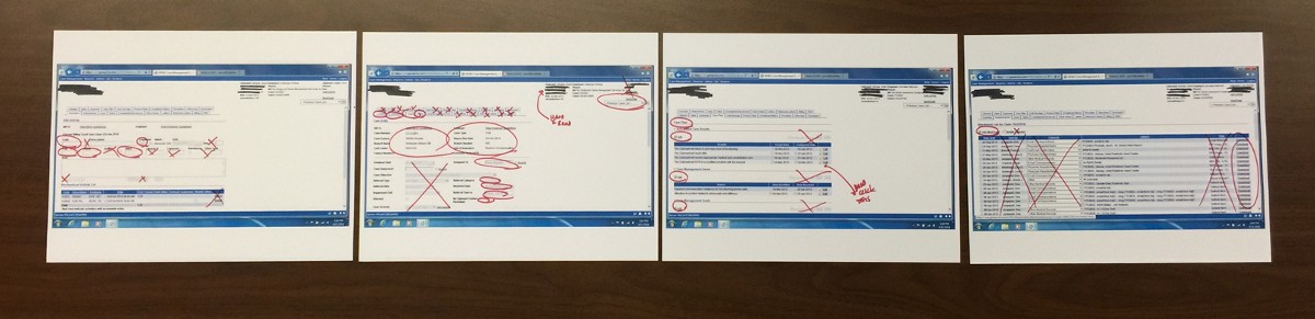
The figure above is an artifact from a project where we needed to extract the key elements for one specific persona. The goal is to understand what people are actually using then prioritize those features in the redesigned workflows.
Find the beginning and the end
Most of the time a product is a means to an end. The need for the product usually comes from somewhere else, and the output goes somewhere else.
"It’s easy to get wrapped up in the process of crafting pixel-perfect designs and overlook beginning and end."
It’s unlikely your users are looking at your product on a crisp retina screen, in a perfectly sized window without any other distractions. You should ask the questions “Where does this information come from?” and “Where does it go next?”.
The answers to these questions are critical for understanding your app’s context. The complexity of the ecosystem your product lives in can have a big impact on your designs. You may learn that your product lives on a desktop with 30 other windows open. Or that it’s primarily used outside on a tablet or for some unintended purpose altogether.
-

- Interviews uncovered people using the product in wildly different ways.

The figure above highlights this concept in action. During an onsite interview we compared how people actually use the product with what we were told from stakeholders. To our surprise each of the participants used the product in a completely different way.
Understanding how the user’s focus and attention was shared between other products and tasks completely changed our redesign strategy.
Prioritize discoverability and learnability
When you download a new app for your phone, it has very short window to onboard you and provide value or it’s dead. That’s a big reason to promote discoverability, because as a consumer you have a choice to use that product or 100 others like it.
This stigma of discoverability tends to carry over into business-class software too. We’ve heard critiques from clients saying they’re worried users won’t find a particular feature, so we should make it more prominent or give it more emphasis. If that happens enough times, you guessed it, things get messy and complex.
"Not every feature needs to blast you in the face to be usable, an interaction can be learned."
This is where we often make the argument for learnability. Not every feature needs to blast you in the face to be usable, an interaction can be learned. Good interactions only need to be be learnt once.
It’s the nature of the beast, complex systems require the prioritization of features at the expense of visibility to others. It’s our job to uncover the primary use cases and make them as intuitive as possible. Users should never have to “discover” frequently used items, nor should they be required to memorize documentation to use the product.
Cleanliness and Clarity
One really big challenge in any business-class product is managing information density. Too much information on the page and it puts users in a mental straight jacket, too little and it starts making it cumbersome to reach meaningful insights. So how do you strike the right balance?
Cleanliness
Sometimes you have a lot of information to cram into a small space, but it’s not critical to have it all on-hand. In this case, we often suggest a progressive reveal strategy for decluttering the UI. Progressive reveal is based on the principle that the user’s interest drives information fidelity.
-

- Progressive reveal — showing more information depth based on interest.
The figure above shows this idea in action. The information in the UI is structured so only the core elements are visible. Then more fidelity is introduced when the user wants it, and no sooner. The trade off, of course, is speed to insight, but you get the benefit of a cleaner, less cluttered UI.
Clarity
On the other hand, some products demand a high-level of data visibility for the job to be done. Financial, healthcare, and e-commerce are industries known for having notoriously complex products.
When data density is important, try to be meticulous about clarity. The way to make dense UIs clear is by being ultra consistent and crisp with the visual language.
"When data density is important, try to be meticulous about clarity."
-

- Systematic use of color, typography, and labeling help keep this UI clear and concise.
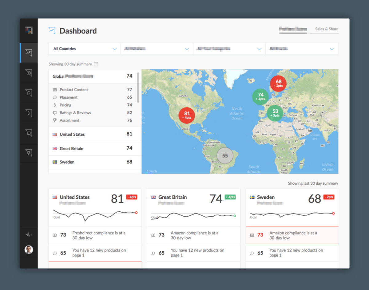
Dialing in that consistency means exercising extreme constraint with the following:
- Type variations
- Button styles
- Simple navigation systems
And being systematic about:
- Color choices
- Labeling
- Even the microcopy
All this adds up to an elegant solution. This topic certainly warrants a bigger, more thoughtful writeup, so I’ll leave it at that.
Animate Signature Interactions
In the past we’ve spent countless hours generating wireframes and tediously connecting them with an absurd amount of lines, boxes and arrows. What’s worse, these deliverables tend to be hard for clients to understand and lead to bad assumptions and convoluted discussions.
Time and time again we see faces light up when we present any kind of motion concepts. So we started creating basic motion treatments to demonstrate signature (read: hard to communicate), interactions.
-

- Early navigation concept that would have been tough to communicate in static comps.
Even with basic grayscale wireframes, these animations zap the ambiguity from the conversation. It’s not a replacement for full wireframes, but it’s a great tool to cut through the complexity of getting people on the same page quickly.
Give ’em what they asked for, and something they didn’t
Henry Ford’s most famous innovation adage captures it best — “If I had asked people what they wanted, they would have said faster horses.”
Clients usually ask for “faster horses”, and probably have an idea of how it should look and work too. Believe it or not, this often leads to unnecessary complexity. We’ve all been there, and like most designers, we get asked to do plenty of things we’re not overly excited about. Nonetheless, it’s important to do what’s asked of you, but it’s also important to do what’s right.
"It’s important to do what’s asked of you, but it’s also important to do what’s right."
It may be considered a bit taboo to present alternative concepts, especially when they are unsolicited. When we have ideas on how to improve or simplify, we try to create a polarizing view and get stakeholders thinking about the problem in a fresh way.
-

- Bringing unexpected ideas to the table can spark fresh thinking.
The goal is to build trust with your client through thoughtful executions backed by reason and data. Our clients respect and generally embrace the fact that we’re challenging assumptions and bringing thoughtful ideas to the table.
Final Thoughts
The changes in devices, apps, and access to data has caused design to evolve in some pretty exciting ways. Less than two years ago the thought of designing for laptop, phone, and watch simultaneously was rare, now it’s table stakes. The landscape of interactions is ever growing, and with that comes an even greater need to manage complexity.
It’s been a fun journey helping so many clients create great products over the years. If you’re on a similar path I hope these thoughts provide some guidance on your next big design project.
This piece was originally published on Erik's Medium profile.