An introduction to the basic ingredients of a TV UI
Welcome to the new Golden Age of television. Not only is there more great television being produced than ever before, but we also have more choice in how we watch our favorite shows. And while we can access these shows anywhere and anytime through our computers, phones, and tablets, televisions themselves still maintain a special place in the home of many.
But we’re no longer limited to a remote and cable box to control our TVs; we’re using Smart TVs, or streaming from set-top boxes like Roku and Apple TV, or using video game consoles like Xbox and Playstation. And each of these devices allows a user interface that’s much more powerful than your old-fashioned on-screen guide.
"Design for TV requires a unique set of considerations"
When compared to computers and even mobile phones, designing for TV UI is still a relatively new area. It’s also a fundamentally different platform. Design for TV requires a unique set of considerations, including screen size and distance, technical constraints, and context of use.
This will be the first part of a series that digs into how to start thinking about interfaces for TV. We’ll also be focusing specifically on the gamepad as an input device, and the basics of using the Gamepad API. In Part 2, we show how you can prototype your TV UIs & controllers together.
The Display
How televisions are different from computers, phones and tablets
The first TVs on the market were made of cathode ray tubes (CRT), a clunky technology that produced inconsistent images across TV sets. This issue was particularly bad along the edges of the screen, so to compensate, CRT TVs were subject to overscan. With overscan, the image itself is enlarged slightly so the edges are outside the bounds of the viewing area.
-

- © All Rights Reserved, Netflix
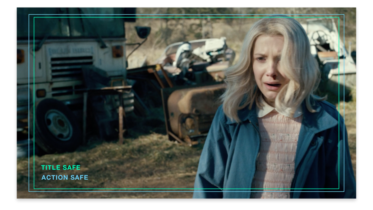
Because broadcasters anticipated some of the image being clipped, they wanted to avoid any critical information being shown too close to the edge of the screen. Historically, there was a title safe area in which text would display with no distortion, and an action safe area where the image could be safely displayed.
For silly and convoluted reasons, overscan still exists on HDTVs. The current recommendation is to set at least a 5% margin to define a general safe area and to keep all TV UI within these bounds. However, this percentage is flexible; Google keeps their safe area narrow, while Apple’s is more generous. We often find ourselves adjusting the safe area as we build our layout grids.
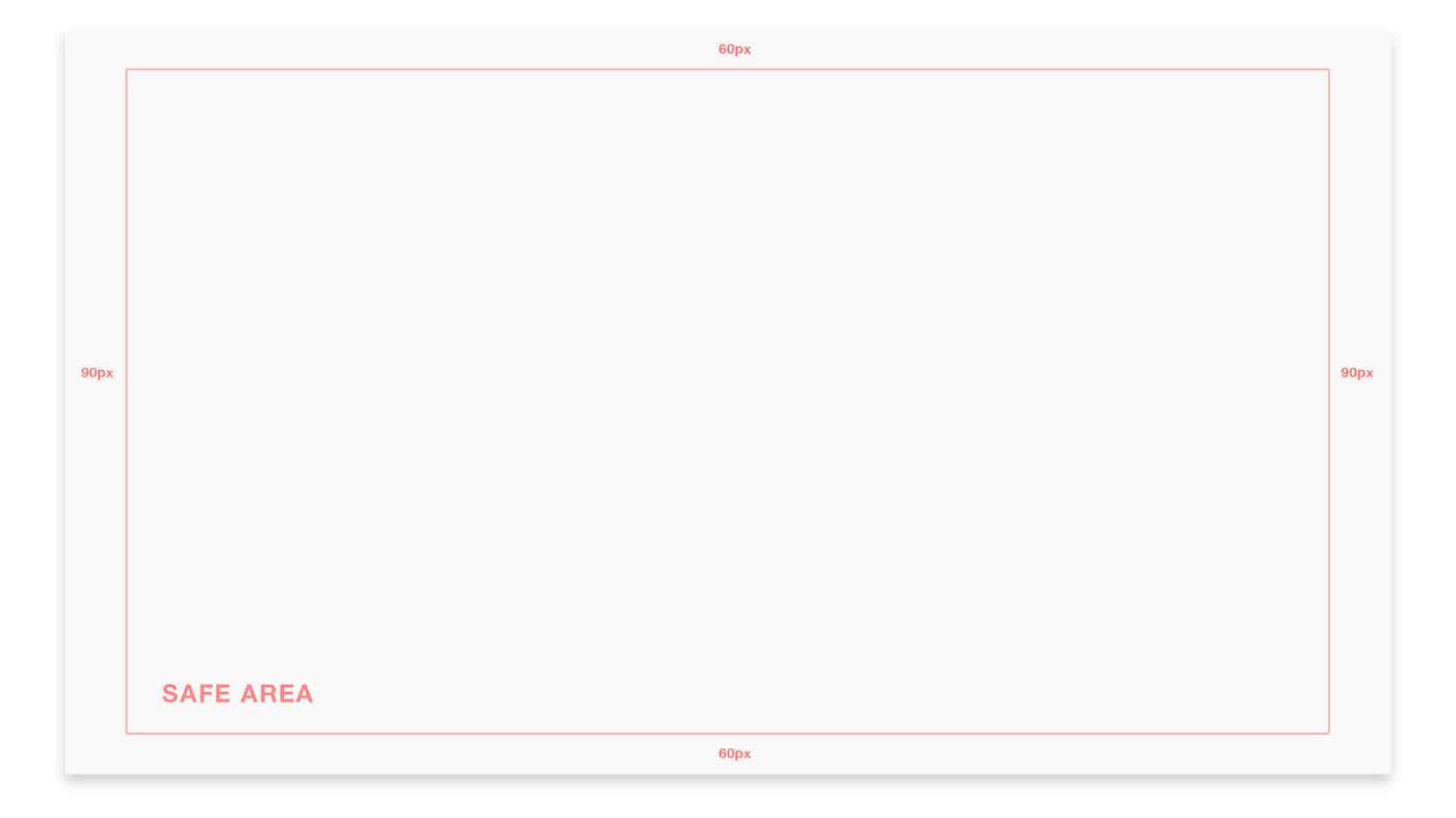
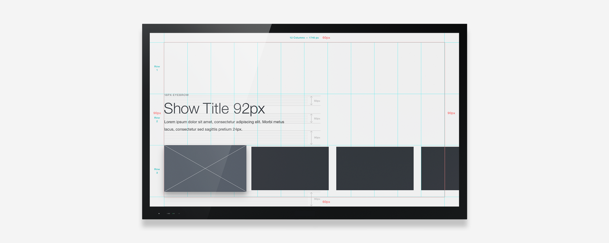
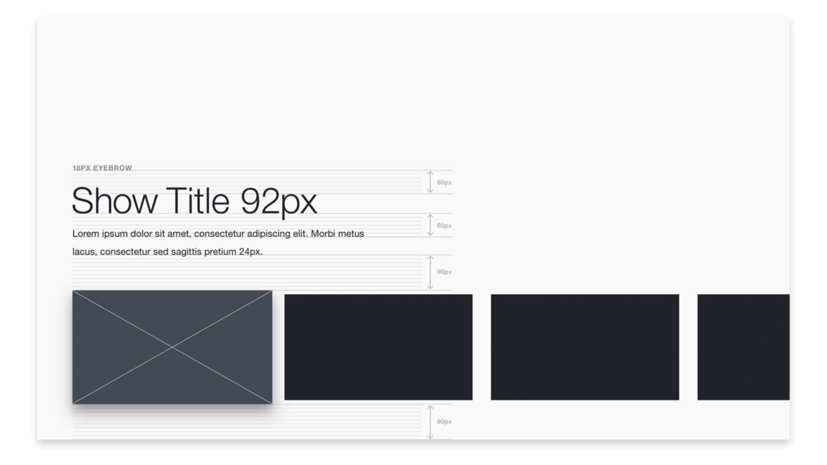
To start, let’s set up our canvas using the standard HDTV dimensions: 1920 x 1080 pixels with 60px top and bottom margins and 90px side margins. We’ll touch on 4k later.
Navigation
How directional input shapes TV interfaces
Hardware often defines design patterns. On mobile, tabs emerged as a navigation pattern given the small yet tall screen size. On TVs, the wide yet squat canvas lends itself to long rows of content that maximize the amount of content visible. Like tabs on mobile, this pattern has become commonplace on most TV streaming UIs.
"Hardware often defines design patterns."

Clockwise from top left: Netflix TV app, Hulu Plus on Playstation, iTunes Store on Apple TV, AMC on Apple TV
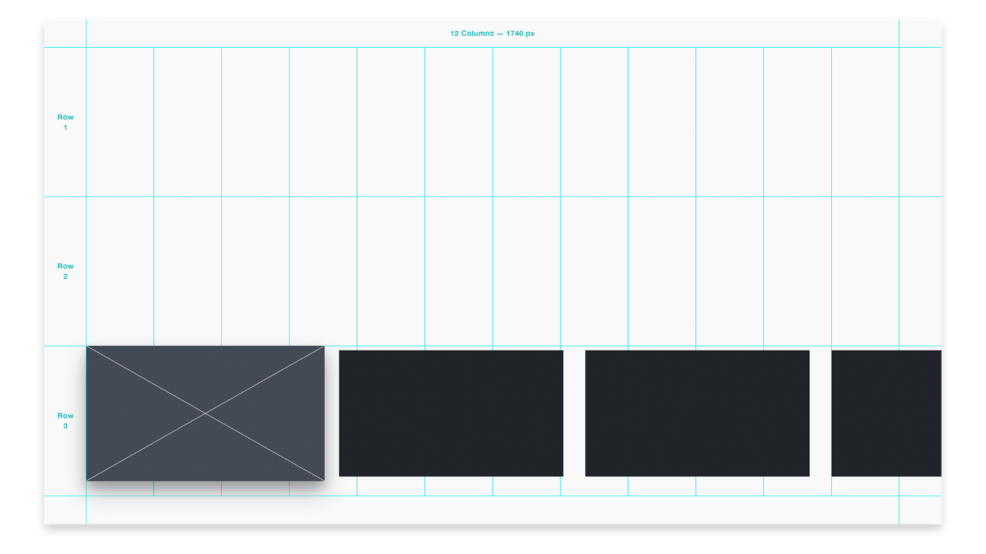
Likewise, the majority of TV UIs (with the exception of the incredibly cute and frustrating LG Bean Bird) are controlled by a D-pad, short for directional pad. Whether on a remote or a gamepad, the D-pad limits navigation to four directions: up, down, left and right. This makes a grid the natural UI structure for TV applications.

Apple TV (top) uses a shadow and z-axis position for its cursor, while HBO GO (bottom) uses a blue stroke
The other critical element in TV UIs is the cursor. Without touch or a mouse, users must navigate to the element they want to select. A cursor highlights the currently selected element and moves as the D-pad input changes. Applications often use borders, shadows, z-axis, or some combination of these to signal the selected state. Every item on the screen must be reachable by the cursor, and it should always be clear where the cursor can move next.
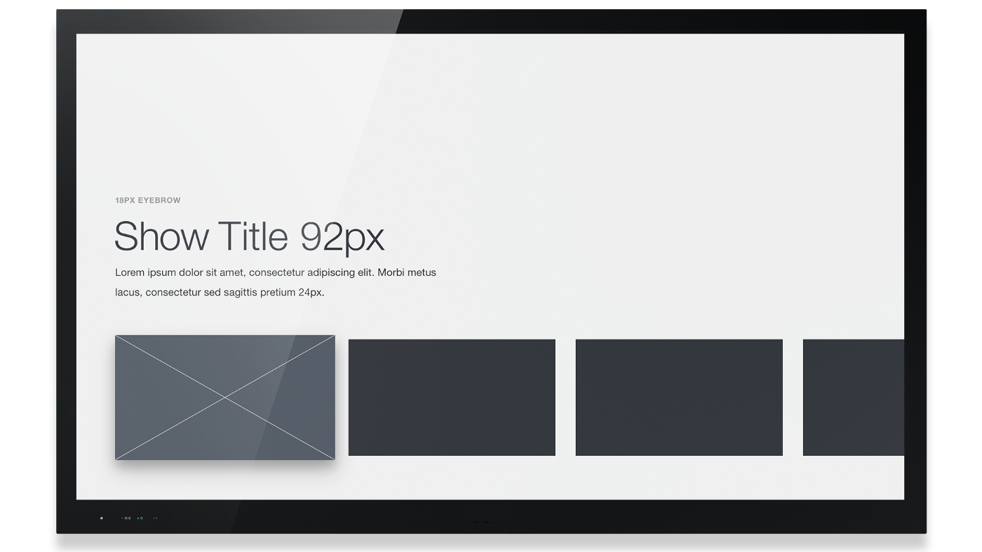
For our prototype, let’s recreate a typical TV UI layout with one horizontal row of content. We’ll add our cursor state to the first item.
Input
How people interact with TVs beyond remotes
-

- From left to right: Logitech Harmony, Samsung Smart TV, Apple TV, Roku, Amazon Fire TV
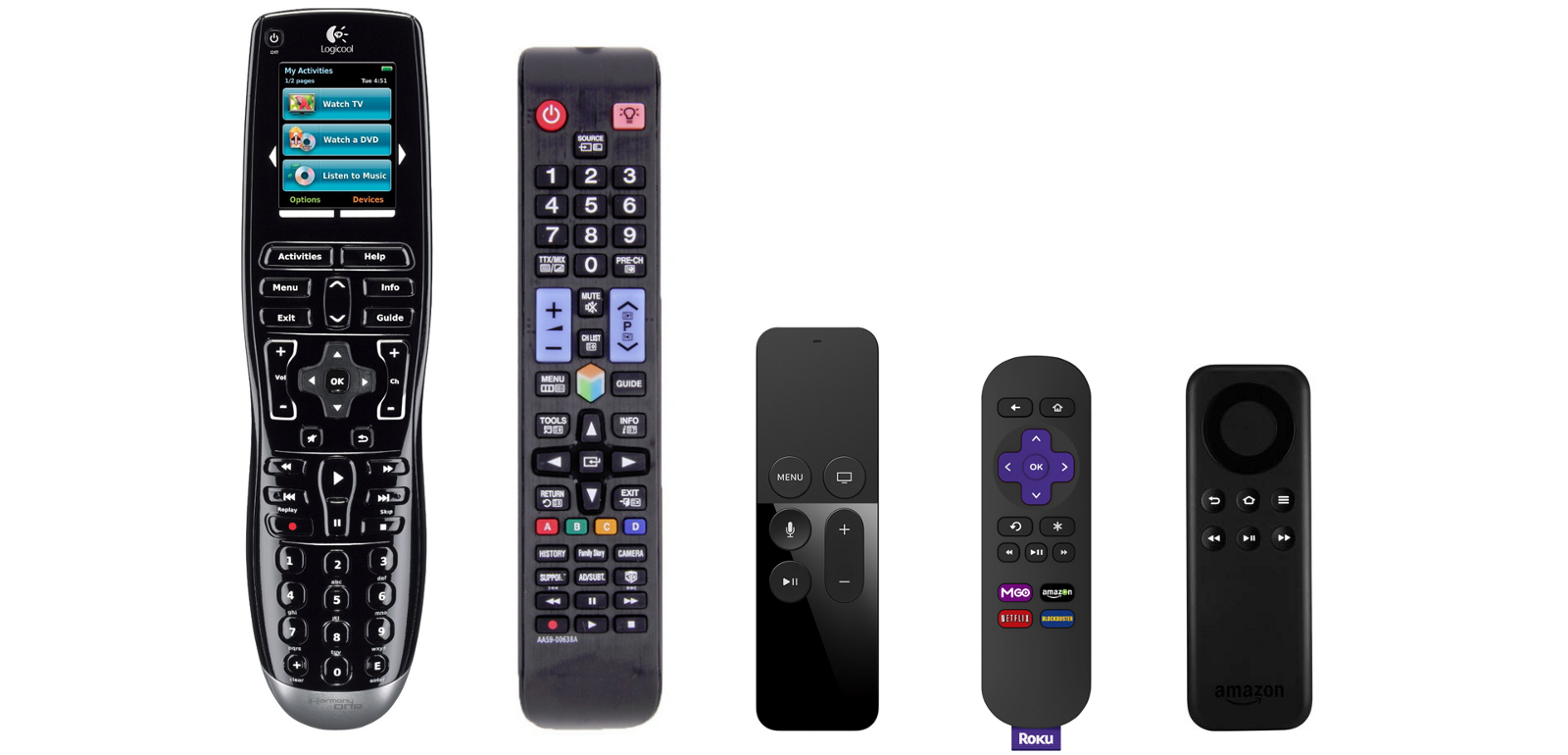
Most TVs and streaming devices rely on some form of remote control. Some platforms are experimenting with voice input, while others, such as the new Apple TV, also use touch input. However, as more streaming services bring their apps to gaming platforms, people are also increasingly using gamepads to navigate TV UIs. Video game consoles are powerful, multi-purpose devices, and here at the studio, we’ve become interested in how best to design and prototype with this hardware.
Navigating with a gamepad provides a number of advantages. In addition to a D-pad, gamepads also have thumbsticks which provide the standard four directional movement, as well as more nuanced diagonal movement. Thumbsticks are faster and more responsive than D-pads, particularly for those who play video games.
-

- An Xbox One controller (L) and a Playstation 4 controller (R)
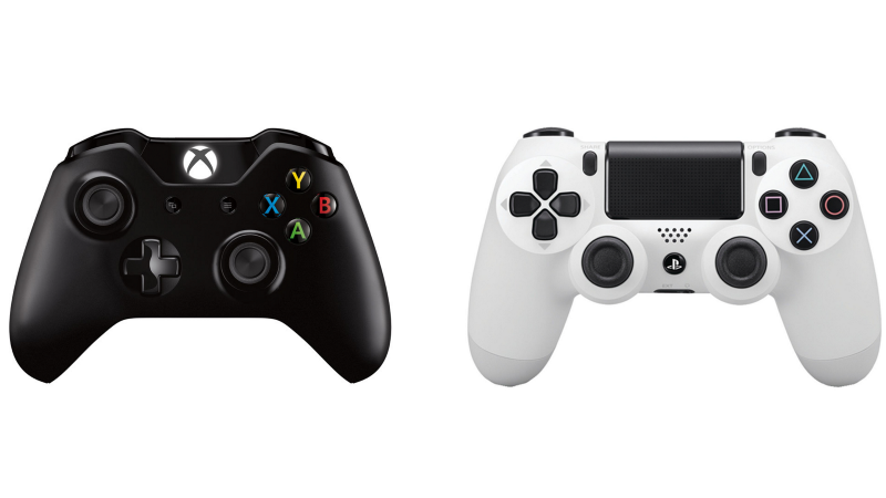
There are some standard conventions shared across platforms, like the Select and Back buttons which share the same position across controllers. Each platform also has its own established conventions. On Xbox, the triggers provide a “Page Up” and “Page Down” control while the bumpers are used to tab between content views. There are also a number of “power user” buttons on each platform that more experienced gamers would be familiar with.
"Context is important when designing for the living room."
However, context is important when designing for the living room. While there may be a primary user who plays video games and is very familiar with the controller, living room devices are ultimately shared devices. We can expect other users less familiar with a gamepad to be using a console for entertainment. For core functionality, it’s best to stick with the standard button conventions.
Typography
Reading an interface from 10 feet away
"Typography can become especially tricky in 10-ft experiences. When in doubt, go larger. "
Imagine you’re sitting on the couch, watching a show on your TV. It’s pretty easy to see the action happening, but what happens when the end credits begin playing? Or a menu pops up?
TV apps are often referred to as 10-ft experiences, a term that refers to a common distance between you and your television. Given this distance, we need to treat a UI a bit differently than we would on web or mobile. UIs should be less dense and design elements should be larger so they can be read from across a room.
Typography can become especially tricky in 10-ft experiences. When in doubt, go larger. Bump up both the size and weight of your type. We’ve found 18px to be the smallest readable size and only appropriate for nonessential labels, like an eyebrow tag. For our design, we’ve set the titles at 92px and the body text at 24px.
"UIs should be less dense and design elements should be larger so they can be read from across a room."
The key to good typography on TV is to test constantly. Thin, small type on your monitor will look clean and crisp, but once on a TV it may appear blown out or become unintelligible. We define our font sizes early in our process by building a test mock and testing type on a TV screen.
Color
Understanding the limits of a TV display
The color gamut on HDTVs is more limited than that of your computer monitor. This means that while designing, you’ll have access to a larger range of color than will display properly on a TV. Different makes and models of TVs vary widely when it comes to brightness, display and other settings. Like type, color should be tested early and often on TVs.
"Like type, color should be tested early and often on TVs."
There are a few guidelines to follow as you begin designing: Avoid pure white, as the bright light is harsh on the eyes. Also take care with gradients and deep blurs, as the limited color range can cause banding to appear. To finish our prototype design, we’ll set our background color to #EEE and hide our safe area and guides.
"The color gamut on HDTVs is more limited than that of your computer monitor."
4K Future
Preparing for the next generation
Unlike mobile phones, most consumers don’t upgrade their TVs on a regular cycle. So while more and more 4K-capable TVs are being produced, we’re still designing for a market that is overwhelmingly limited to 1080p.
Eventually this will change, and much like accounting for different screen sizes in mobile design, designers will soon be designing for TV at 2x. In addition to better picture quality, the greater pixel density means sharper and more legible type and UI.
Perhaps the most promising development for UIs designed at 4K will be an increased color range and depth. Current HDTVs use a color profile named Rec. 709 which provides a fairly limited range of color. A new profile, Rec. 2020, was developed for 4K TVs and provides a larger color range.
"Perhaps the most promising development for UIs designed at 4K will be an increased color range and depth."

However, more important than the range is the color depth. Most current HDTVs provide 8-bit color. This means there are 256 shades of each RGB color channel available for a total of 16.78 million possible colors. New 4K TVs with 10-bit or higher color and will provide at least 1,024 shades of each color channel, making possible over 1 billion colors. With a greater color depth, banding on gradients and blurs won’t be visible, providing designers with more opportunities to use color and manipulate photo assets.
Prototyping
The most important part of designing for anything
Now that we have our basic design, we’re ready to begin prototyping. Check out part 2 where we explain the basics of prototyping navigation behavior with a gamepad controller using the Gamepad API and some basic HTML/CSS/JS.
Here are some additional resources to start designing your own UI:
Download Examples (PSD)
tvOS Human Interface Guidelines
Designing for Android TV
Amazon Fire TV Design and User Experience Guidelines
This post was originally published on This Also's Medium.
Did you know that Marvel supports Apple TV prototypes? Find out more here.