
Color is a powerful force in the hands of a designer. It draws your eye, evokes emotion, and communicates meaning. To give you an idea of how important color is, in a widely cited study titled The Impact of Color on Marketing, researchers discovered that for some products, 90% of snap decisions people make about products could be based on color alone.
"90% of snap decisions people make about products could be based on color alone."
So effectively using color is important to designs. But coming up with different color combinations is also hard. Each color has its own meaning, and there are an infinite number of combinations out there.
This article is designed to serve as a guide to help you come up with color palettes for your designs. It encourages you to explore more with color, which will help you develop an intuitive sense for good color combinations.
As you explore more with color, you’ll develop an intuitive sense for good color combinations.
Choosing a color palette
Sometimes a color palette is the result of sudden inspiration. But most of the time, it comes from taking a systematic approach.
Identify purpose
"Good design aligns its color palette with its purpose."
Before doing anything else, first identify the purpose of your design. Good design aligns its color palette with its purpose.
Ask yourself the following questions:
- What is the message that you want to convey with your design?
- What is the purpose of your design? To be informative? To convince?
- What emotions do you want your design to evoke?
The purpose of your design should serve as a guide for you as you choose your color palette.
Identify your audience
-

- Who is your audience and how does that affect your design? – Qualtrics Target Audience Illustrations by Jeff Wiggins.
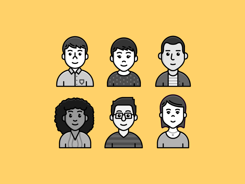
People perceive colors differently. As Fairchild put it, color is a psychological phenomenon that arises within the observer. Colors have different effects on people based on their personal preference, cultural upbringing, and experiences. As such, in order to understand how people will react to your design, you need to identify your audience.
"Colors have different effects on people based on their personal preference, cultural upbringing and experiences."
While some meanings of color are universal across audiences, others are not. Green universally represents nature as it’s the color of vegetation. However, a color like red is interpreted differently across cultures. In the western world, red is associated with fire, violence, and warfare. It is also associated with love and passion. However, countries like China associate red with prosperity and happiness.
-

- Chinese red envelope – ECESIS: Ang Pow Design.
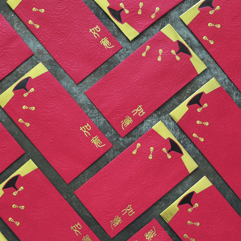
Because colors have so many different meanings, it’s important to match the mental color models you have as a designer with the ones of your audience.
"It’s important to match the mental color models you have as a designer with the ones of your audience."
To read more about what colors mean across different countries and demographics, check out The Psychology of Color in Marketing and Branding and The Meaning of Color.
Review color theory
When choosing a color palette, it’s sometimes helpful know a little color theory. Color theory is a logical structure and practical guide for mixing colors. It encompasses everything from the color wheel to the meaning of individual colors.
A good primer is Color Theory by Design School, and Color Theory 101 by Hubspot. You can read about an interesting application of color theory in Why Is Facebook Blue? The Science Behind Colors In Marketing.
Find inspiration
"Try looking at designs that come from outside of the specific medium you are designing for."
Sometimes it’s hard to visualize the right color palette for your design. That’s okay, great artists steal. Or rather, they take inspiration from other artists.
The usual suspect for color palette inspiration are sites like Dribbble and Behance. If you want to find color inspiration for a specific design style like material design, you can use a site like MaterialUI. The flat design equivalent can be found at FlatUIColors.
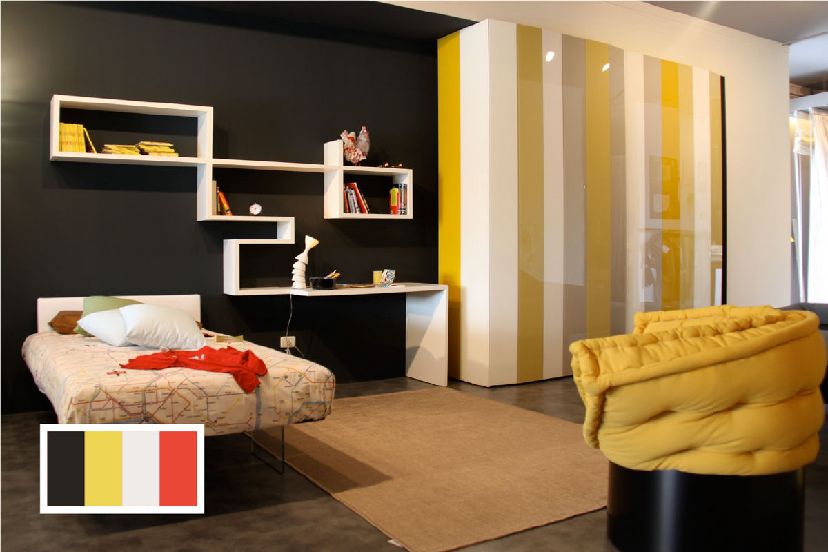
Those sites are useful, but try looking at designs that come from outside of the specific medium you are designing for. Doing so will help you come up with unexpectedly unique and pleasing color palettes. As an example, you could look at interior designs.
-

- Interior designers use color to bring spaces alive – via Lago.
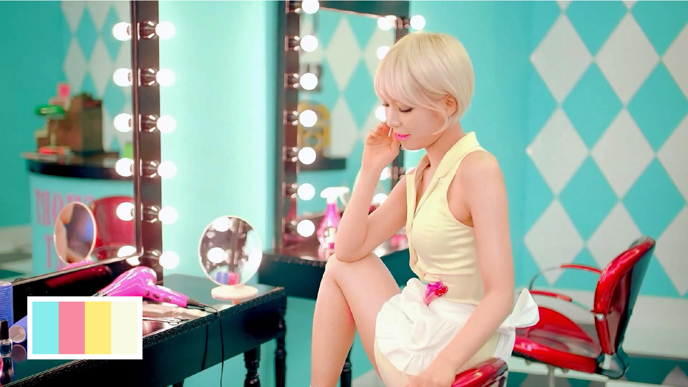
If you want something different, look for color inspiration in the design of other cultures. For example, Korean music video set designs are known for their colorful and eye catching color palettes. Each frame can serve as a source of inspiration.
You don’t have to go to Korea to find color inspiration. It’s everywhere, including your daily life. Next time you go out, stop to appreciate the colors around you.
When you find something that inspires you, create a color palette for it. You can use the eye dropper tool in your favorite design program to tease out a color palette and make adjustments if necessary.
Establish a design system
A design system, sometimes called a style guide, is a framework that encapsulates all the elements that go into your design. This includes everything from buttons to typography. Consider things like what kinds of buttons you will use and what your navigation bar looks like.
For an example of a design system, check out the design system of Salesforce. For even more examples, here is a list of 50 Meticulous Style Guides Every Startup Should See Before Launching.
It’s helpful to establish a design system before choosing a color palette, even if it’s just a rough sketch. Doing so will give you an idea of what elements you have and how your colors could apply to them.
When choosing a color palette for your design, it’s best to stick to the KISS (Keep it simple, stupid) principle. The fewer the colors, the better. For most design systems, the following structure is a good start:
- Background
- Primary accent
- Secondary accent
- Error color
- Success color
The primary color is the color you most often use for important buttons and accents. For many companies, this is also the color of their logo.

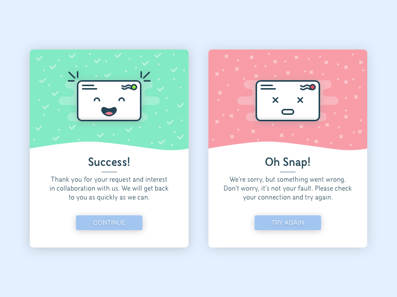
The secondary color is the color you use to differentiate secondary actions from primary ones. For example, primary and secondary buttons. Error and success colors, typically red and green, convey design states. For example, success or error notifications.
-

- Design States – Flash Messages by Nick Velichkin
Choose a color palette
Now that you are armed with inspiration and a rough sketch of a design system, it’s time to choose a color palette.
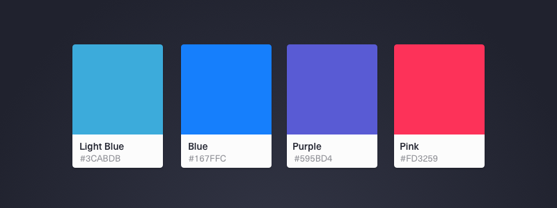
For a basic color palettes, I like to put my colors side by side, just like an artists would for their paint palette.
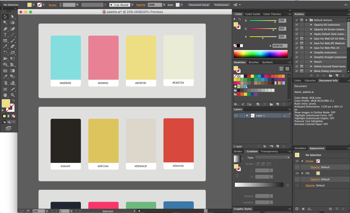
This is the time to take all your color inspiration and create color palettes out of them. The more the better. Don’t be afraid to experiment with colors on your own as well.
When narrowing down your color palette options, think back to the first two sections where you identified the purpose and audience of your design. Ask yourself the following questions:
- What colors are accessible?
- What colors have visual impact and draw your eye?
- Do you need a light or dark color scheme? What time of the day will people use your product?
- What mood do you want your design to convey? Does any one color palette you have do this better than the others?
"Colors will have different roles in your design system."
As I mentioned in the last section, colors will have different roles in your design system. This also means that each color carries a different weight in your system. For example, your background colors will be used more often than accent colors.
Because of this, it’s sometimes a good exercise to create a throwaway design composed of shapes of different sizes, with each size roughly equaling the frequency of occurrence and average surface area of the color on a given page.
Applying color palettes
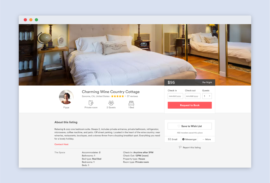
To give you an idea of how to apply colors to design systems, let’s take a look at Airbnb. Airbnb’s primary color is Rausch, named after the street the company originated from. Kazan serves as a secondary color and the two grays are used as backgrounds colors.
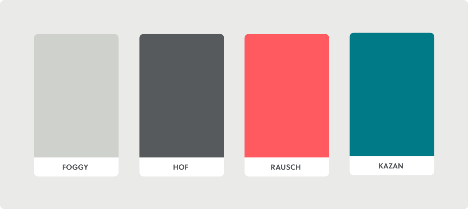
For most pages, Airbnb uses foggy grey as a background. You can see that they use the rausch as their primary color to accent important actions like requesting to book a listing.
Kazan, the turquoise color, is used to catch and engage your eye. Notice how it compliments the primary color.

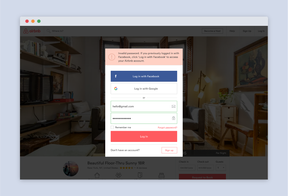
For error messages, Airbnb uses a light red, arguably a shade of rausch. The red, along with the exclamation mark, immediately draws your eye and notifies you of the state of the system.
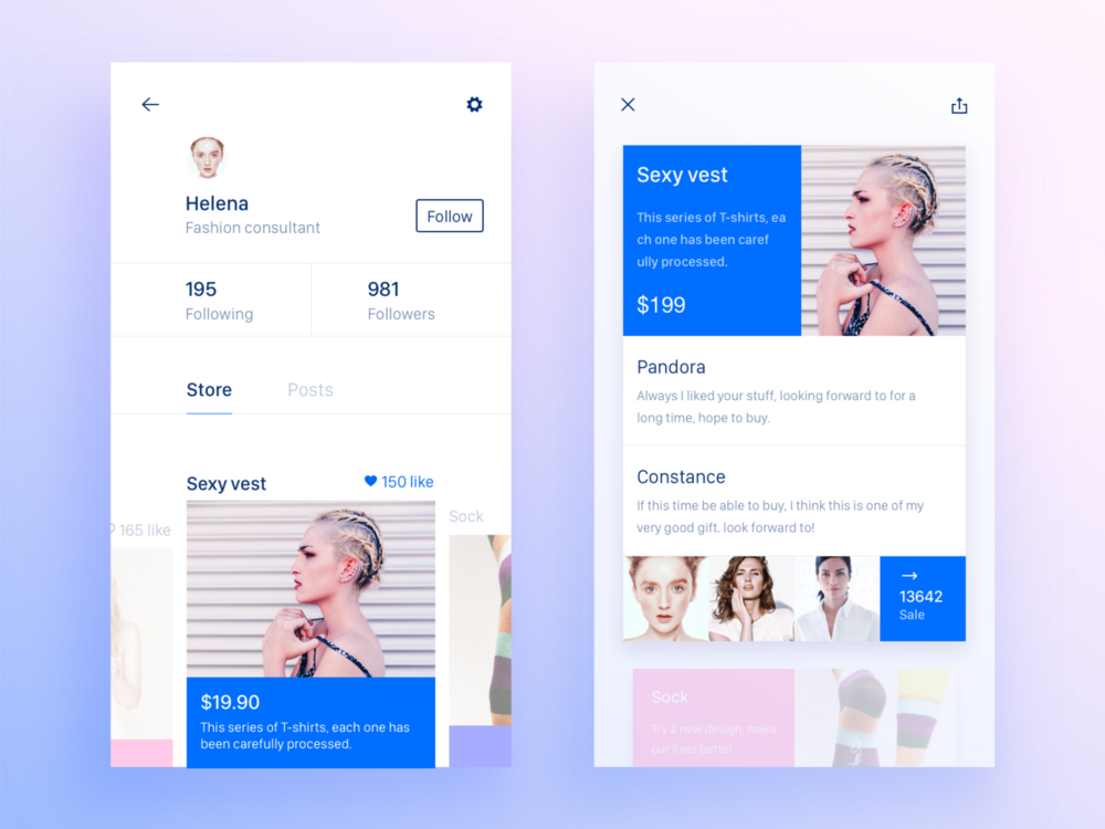
Start off without any color in your design. Focus on layout and placement of elements. After you’re satisfied with what you have, then you can start applying your color palette to your design.
-

- Start off without color and slowly add from there – Store/Sale by Gale P.
Think of visual hierarchy in your design. Consider what design components you want to highlight and assign the appropriate color. Also, consider using different shades of your colors for things like hover and click states.
Wrap up
Color is all about experimentation and iteration. If you want to become better at working with color, the only answer is to do more work. Think of color as an additive. If you have the layout and functionality of your design down, then you can experiment with as many color palettes as you want.
Learning how to design with colors is infinitely valuable to a designer. As you get better at picking color palettes, you develop the ability to visualize colors combinations on a design before even touching a design program.
This post was originally published on Jonathan's Medium profile.

