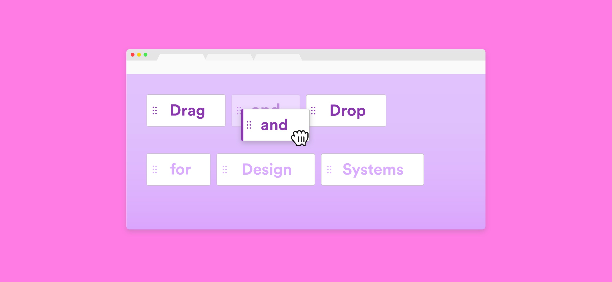
You probably use drag and drop in your everyday interfaces — dropping Gmail threads into folders, moving around Trello cards, or rearranging tabs in Chrome. These interactions are a lot more complex than you think, something that I learned while designing drag and drop patterns at VMware.

Dropping Gmail threads into folders

Moving Trello cards around (Asian crackers????)

Rearranging tabs in Chrome
Drag and drop interactions are often overlooked or go unnoticed. Sometimes they happen so naturally that you don’t even realize it. But if you look closely and compare these three examples, each one demonstrates very different UX standards around drag and drop.

There’s nothing wrong with these interfaces having different UX standards around drag and drop. Each interface probably selected certain patterns over others for a reason. For example, maybe Trello chose to tilt cards when they are dragged because this behavior fits their friendly design language.
But where the problem lies is when there aren’t clear UX standards for drag and drop within a common interface. You might come across instances when dragging something in one part of an interface is a completely different experience in another.
To illustrate this, let’s take a look at Salesforce’s accessible drag and drop library. It showcases five patterns for drag and drop, each of which is a drastically different experience from the other.

Salesforce’s accessible drag and drop patterns
While many great points are made about accessibility (check out an interesting article written about it ????????), unfortunately there is little design consistency across these five patterns. A different cursor is used in each of the five patterns, and there are three different icons being used as drag handles:

But which one is for drag and drop? Answer: All of them.
Does a three-line icon indicate a draggable element? Or is it a three-dot icon? Which of the five cursors shows that I can drag things? Imagine the confusion of having all five patterns applied to one interface!
In a design system, components should look and feel like one cohesive entity. Likewise, drag and drop interactions should look and feel consistent across components within an interface.
"Design systems don’t just create consistency across UI components — they should advocate for consistent experiences too."
Case Study
This is a UX case study about drag and drop patterns I worked on for Clarity, VMware’s design system. Clarity is open source, so our users aren’t just VMware employees, but anyone who wants to leverage our Angular-based library or design guidelines.
Our users requested the ability to perform drag and drop on some of our UI components: tree view, datagrid (data table), and cards. My task was to unify the user experience across all of the following use cases involving drag and drop:
Use cases
- Reordering and nesting tree view nodes
- Reordering columns in a datagrid
- Reordering rows in a datagrid
- Drag and drop between a tree view and a datagrid
- Rearranging and merging cards
For data-heavy enterprise UIs like VMware’s, drag and drop is crucial to enabling our users to organize complex and large amounts of data.
Creating an affordance library
I started by establishing a small library of simple, yet effective design affordances that represent drag and drop and tie separate instances of drag and drop together. That way, the affordances can still be applied to new use cases that aren’t one of the ones listed above.
If you work on a design system team, these might help you start thinking about how to address drag and drop patterns for your own design system.
1. The color purple (not the book, or the movie)
Use a distinct color choice that isn’t used often in your design system to identify drag and drop interactions. Avoid colors that already have significance in your interface (ex: red for destructive actions).

Rearranging cards (Stranger Things, amirite?)
We chose the color purple to represent drag and drop in every single use case. Purple isn’t a primary color used in Clarity, so whenever users encounter the color purple, they can expect some sort of drag and drop experience. We purposely avoided using blue (which is a common color for drag and drop) because in Clarity, it’s reserved for action buttons and other clickable elements.
2. State styles
Establish styles for the different states of an element being dragged. Specify exactly what kind of visual treatment an element will get while it’s being dragged, after it’s been dragged, etc.
In Clarity, while an element is dragged, it will have the following styles:

Reordering tree view nodes
Adding a subtle drop shadow gives the impression the element is actually being picked up off of the page.
Another state we added was the original position of an element while it’s being dragged, called Previous state.

Nesting tree view nodes
This acts as a small reminder to users where the element was previously. Note that this state wouldn’t apply to natural movement drag and drop, which is when other elements naturally move out of the way of a dragged element.
3. System cursors
Use system cursors to indicate when an element is draggable. This one seems minor, but will significantly improve discoverability of draggable elements.

For Mac, we use the grab (open Mickey Mouse hand) and grabbing (closed Mickey Mouse hand) cursors. The grab cursor appears on hover when an element is draggable. Once it’s dragged, the cursor will change to the grabbing cursor. For areas where an element cannot be dropped, we used the unavailable cursor.
For Windows, we use the move cursor (arrow cross). The cursor will remain the move cursor while an element is dragged. Again, for areas where an element cannot be dropped, we used the unavailable cursor.
4. Drop targets
Establish patterns for drop targets, which are valid areas where dragged elements can be dropped. Like state styles above, explicitly write out what styles drop targets have.
Since reordering is a key drag and drop interaction, we specified a position drop target, which indicates the position where an element will be dropped.

Reordering rows in a datagrid
We added a circle to the left-end of the position target to differentiate the drop target even more from just a normal line or border. This is an important additional affordance, especially to color-blind users who might not notice the color change.
Case-by-case affordances
One area that depends on a case-by-case basis is when to present drag handles. Drag handles are small icons that indicate an element is draggable. Gmail chose a 12-dot icon for drag handles, while we chose a six-dot icon for drag handles:

The presence of drag handles largely depends on context. For components that don’t typically involve drag and drop, a drag handle helps users discover drag and drop as an available action. But in cases where drag and drop is always an expected behavior, it isn’t necessary.
For example, we didn’t present handles in a tree view because it’s expected to be able to move around nodes in a tree view. However, we did present handles for cards because not all cards are draggable.
There are many different icons used to represent drag handles, but choose only one and stick with it.
One drag and drop family
These standards will help set up a basic foundation for connecting drag and drop instances within an interface, but there are many other ways to standardize drag and drop across components.
Setting up any kind of UX standard will help drag and drop become a familiar interaction rather than feeling like a disjointed experience. See how the drag and drop use cases I designed all came together after I applied the affordance library: Invision.
The Clarity team is just starting the development process for these drag and drop patterns, starting with reordering columns in a datagrid. You can actually track development progress in our GitHub repo. ????
Sources
- Alex Reardon’s amazing article was my drag and drop bible
- Salesforce UX’s accessible drag and drop patterns
This article was originally published on Grace's Medium page.