Google launched Android Lollipop which introduced some major changes and a new visual language called Material Design. With this new OS, Android is bringing a comprehensive guide for visual, motion, and interaction design across platforms and devices.
Last October, I attended a workshop hosted at Google where Material Design’s UX team shared insights on this new approach to Android’s design as well as tips on how to use it for third party apps.
I strongly believe this new way of designing apps for Android marks a solid step in the right direction. The system is consistent and flexible enough to adapt to any app’s design. This is why I went back to the drawing board and started redesigning what feedly could look like following the Material Design principles.
This exploration’s main goal was to create a new version of feedly, fully enhanced with Google’s Material Design to give our team a design direction for future releases. In the coming months we will be taking some ideas from it and implementing them in our new app.
The secondary goal is to get feedback from the feedly community. So please don’t hesitate to leave comments if you have any suggestion!
In this post I am sharing the results of this work as well as the motivations behind some of the design decisions I took along the way.
Alright, enough talking, time to dig into Material Design!
Overview
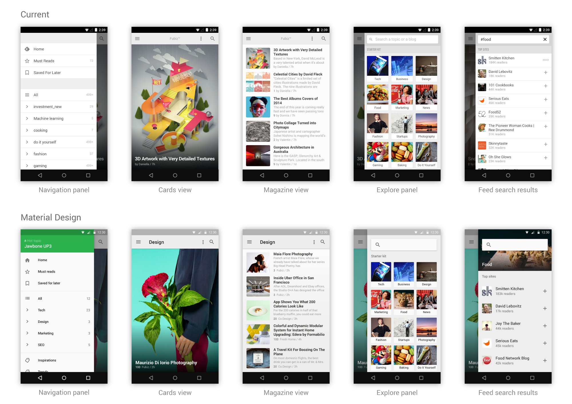
On this redesign I worked on the main feedly mobile screens. Here is a before and after view of feedly for Android.
The Material Design guidelines can be pretty intense to read but during the workshop four core principles were emphasized. They are the ones I have used to frame my work.
Tangible interfaces
Material Design Principle
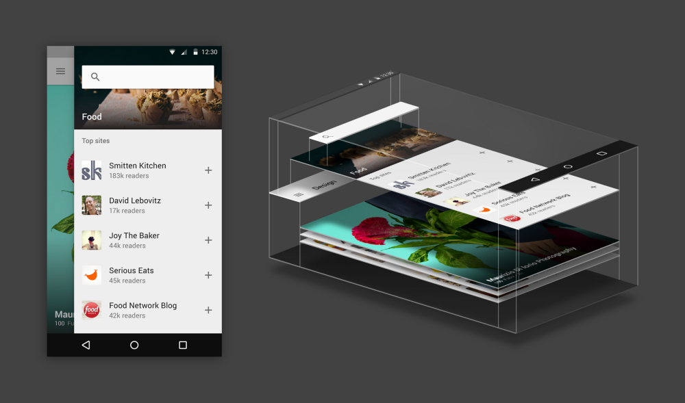
“In material design, every pixel drawn by an application resides on a sheet of paper. Paper has a flat background color and can be sized to serve a variety of purposes. A typical layout is composed of multiple sheets of paper.”
A principle applied to feedly
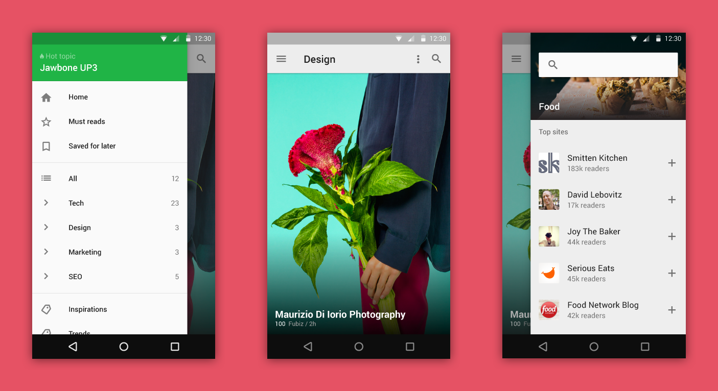
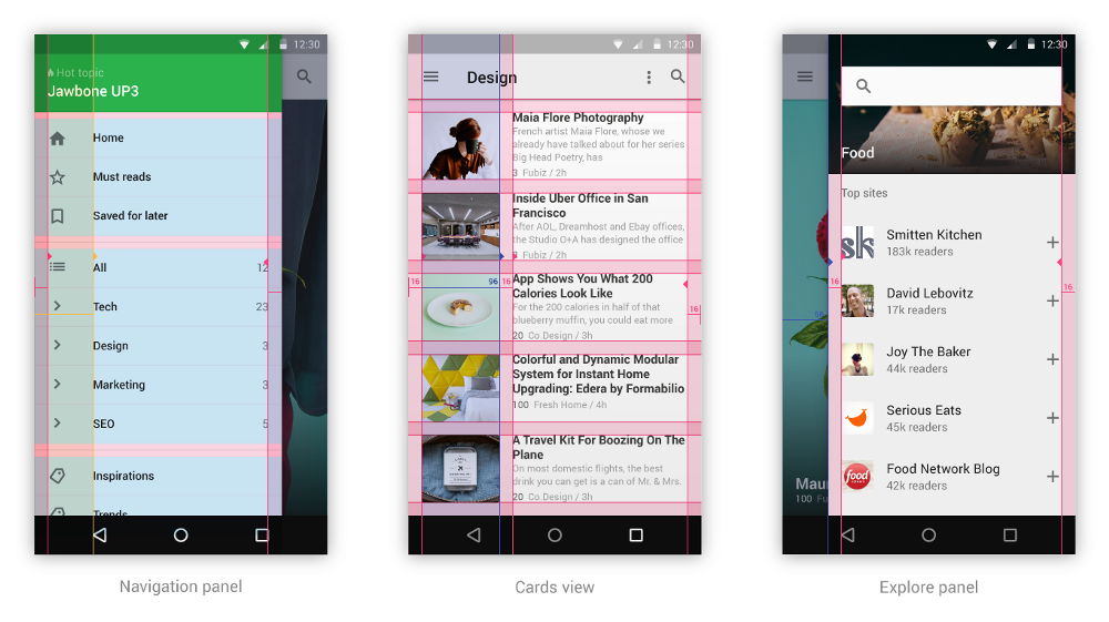
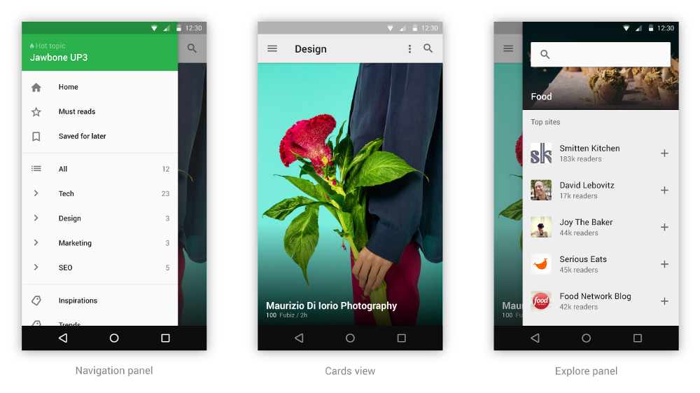
Feedly is already using a metaphor which fits perfectly in this framework. The main element of the feedly mobile experience is a stack of cards where each card has a list of articles. You can swipe up each card to reveal the next one.
Feedly’s navigation happens on a left panel which slides above the stack of cards. The same thing happens with the explore panel which slides from the right and lets you discover new feeds.
Print-like design
Material Design Principle
“The foundational elements of print-based design — typography, grids, space, scale, color, and use of imagery — guide visual treatments. These elements do far more than please the eye. They create hierarchy, meaning, and focus.”
A principle applied to feedly
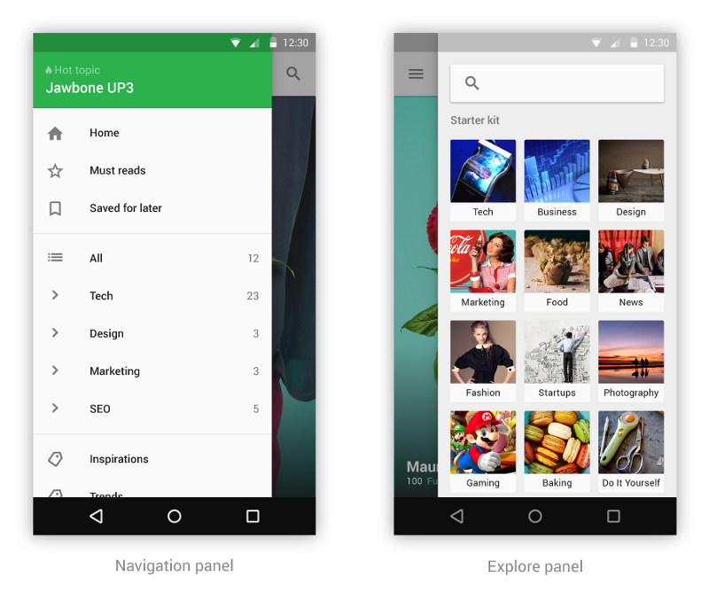
8dp grid
Google provided some great resources to help designers size and position their app’s main elements in a consistent way. But you also need to understand the overall grid system. Though it is an 8dp square baseline grid, most of the time Android actually uses 16dp as margin size. In addition to following these guidelines for our side drawers I also modified our magazine view grid system to have all margins set at 16dp and bring more consistency in our design. The thumbnail images are 96px wide (12 x 8).
Color & imagery
Google recommends to use the primary color in the toolbars and status bars which usually means using your brand’s color in those areas. Because feedly is a reading app, using our bright green in these bars would be very distracting when your eyes try to focus on content. I chose to use a light grey instead to create a less intrusive toolbar.
On the left drawer I created a toolbar using our brand color to highlight the trending topic of the day. This is a nice way to use our brand’s color to emphasize a key piece of information.
Imagery is also really important. In magazine view I used full bleed images to represent articles with high engagement. I also use a full bleed image as the header of the selected topic in the explore panel.
Meaningful transitions
Material Design Principle
Carefully choreographed motion design can effectively guide the user’s attention
“Sometimes, it is difficult for a user to know where to look or understand how an element got from point A to point B. Carefully choreographed motion design can effectively guide the user’s attention and focus through multiple steps of a process or procedure, avoid confusion when layouts change or elements are rearranged, and improve the overall beauty of the experience. Motion design should serve a functional purpose.”
A principle applied to feedly
In feedly the most important transition happens when opening and closing an article. In this transition you move from a list of articles to the article view featuring the whole article’s content. To help create this transition I followed 3 main principles recommended by the Material Design guidelines.
Surface reaction
I use the Touch Ripple effect when the user interacts with the article preview to provide him with instant feedback. The Touch Ripple effect scales into the entire article preview element.
The same thing happens when the user closes the article where the Touch Ripple appears in the top bar.
Visual continuity
The image previewed on the magazine view is scaled up and moved to the correct position on the article view. This allows for the user to perfectly understand the relationship between the element touched and the final element. The challenge though is that in some cases the thumbnail image displayed as a preview only appears after a few paragraphs of text in the article view. In that case the image isn’t shown on the article view before you scroll down a bit. In those instances we would have to fade the thumbnail away and fade the article’s content in as the article view reveals itself.
Tangible surface
This is probably one of the most important aspects of Material Design. With this principle we want to show how content is printed on tangible surfaces. When the user touches the article preview we lift it to become its own surface. And following the visual continuity principle we then scale that surface to become the main surface of the page. As this motion happens we fade the article’s content in.
After putting all these principles together, here is the final animation:

I also followed the same principles to design an animation when selecting a topic on the explore panel.

Adaptive design
Material Design Principle
“Our final core concept of material is creating a single adaptive design that works across devices of all sizes and shapes, from watches to giant TVs. Adaptive design techniques help us realize the vision that each device reflects a different view of the same underlying system. Each view is tailored to the size and interaction appropriate for that device. Colors, iconography, hierarchy, and spatial relationships remain constant. The material design system provides flexible components and patterns to help you build a design that scales.”
A principle applied to feedly
Since its initial launch the feedly mobile app has been adaptive. The main elements that need to be adapted are the cards displaying articles. The magazine view has always been the most challenging and interesting one as it features articles of various sizes. As you can see the the visual below, each screen size allows for a different and interesting layout.

I hope you enjoyed this post on our Material Design exploration. If you have any feedback or other ideas about how feedly could better embrace these principles please leave a comment.
This article was originally published on Arthur's Medium page.