In discussions we’ve had with designers in retail, a lot of their focus has been around optimising the mobile app, simply because mobile activity increases by the thousands every year. More recently, we spoke to notonthehighstreet.com who have spent time this year focusing on an alternative and more traditional channel - Apple TV.
“People have been using the TV as a format for buying since its inception.”
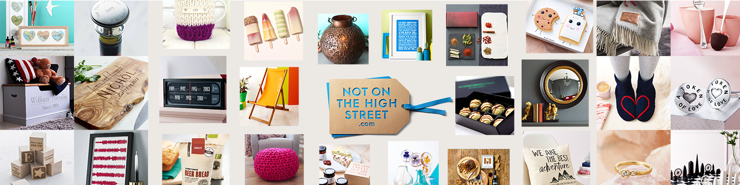
Notonthehighstreet.com was founded 10 years ago by Holly Tucker and Sophie Cornish who recognised the huge potential that technology could play in connecting creative small businesses with the world. Today, the company stocks over 200,000 unique products made by 5000 independent businesses across the length and breadth of the UK; products that you can't find on the High Street.
Now employing 250 people in its headquarters in Silicon-upon-Thames, Keith Port, Senior UX Designer, Rob Stearn, iOS Delivery Manager and Tom Bown, Senior UX Designer, tell us that although it has grown in numbers the company remains as committed to its purpose as ever.
“We get the absolute sense that we’re a part of something, this isn’t just a day job.”
Why tvOS?
Despite their function having been heavily focused on mobile like many others in the sector, the design team began working on an alternative channel off the back of a company hack day. “Hack days allow us to connect with different parts of the business that we don’t normally converse with, they inspire new ideas and we get to put stuff together in a matter of two days.”
Keith tells us that they were inspired by talks of TV being a universal platform which has long been utilised for buying. From its first channel Ceefax in the 1970s through to the arrival of teletext and now Apple TV.
“Wouldn’t it be great to optimise our presence on Apple TV so our partners and sellers get more exposure?”
What was your design process around building for Apple TV?
Keith: There were literally three of us working on it at the time and it was kind of a post-it notes and tear-it-apart strategy. With these meetings you essentially have to leave your ego at the door and just be accepting and encouraging of every idea, no matter how silly or stupid. I use this philosophy quite a lot even in design sprints, to just keep going and iterate, iterate, iterate. Quite often you will find that the most surprising and brilliant ideas don’t come from UX.
Marvel plays a large part in our design process especially when it comes to quick iterations - it’s fantastic for that and the TV app was no different. I’ve been using it since beta and have introduced it to all parts of the business. It was perfect for designing the flow between our initial sketches.
Rob: When we came to think about NOTHS for Apple TV, we realised that we had a strict deadline to do it. We had some very specific ideas of what we wanted to do, both from a function and features point of view. We wanted it to be more than just a pretty app for pictures but also have functionality.
We also had a really useful set of UX suggestions which actually came straight from Apple about our main phone app. So we did a UI review at WWDC and they gave us a whole bunch of feedback. We took two or three of those concepts and started building the TV app around them.
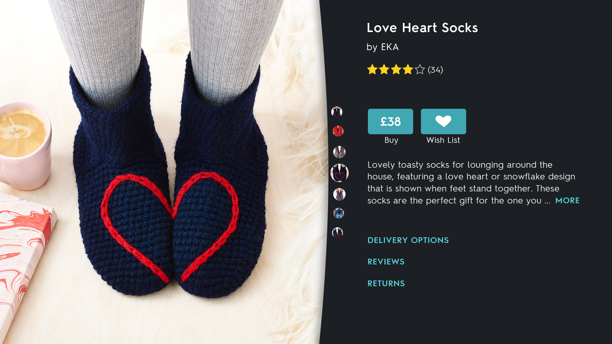
Then we started to build and what we really wanted was to make sure that Keith was an integrated part of the team to optimise UX. We built the key contributors and got it to a good state before starting to say, “Right, is this good enough? Is this perfect? Could it be better?” We developed this nice working relationship where an idea would come up between the three of us and we would refine it. I think the best example of that is the product page.
-

- Product Page Apple TV
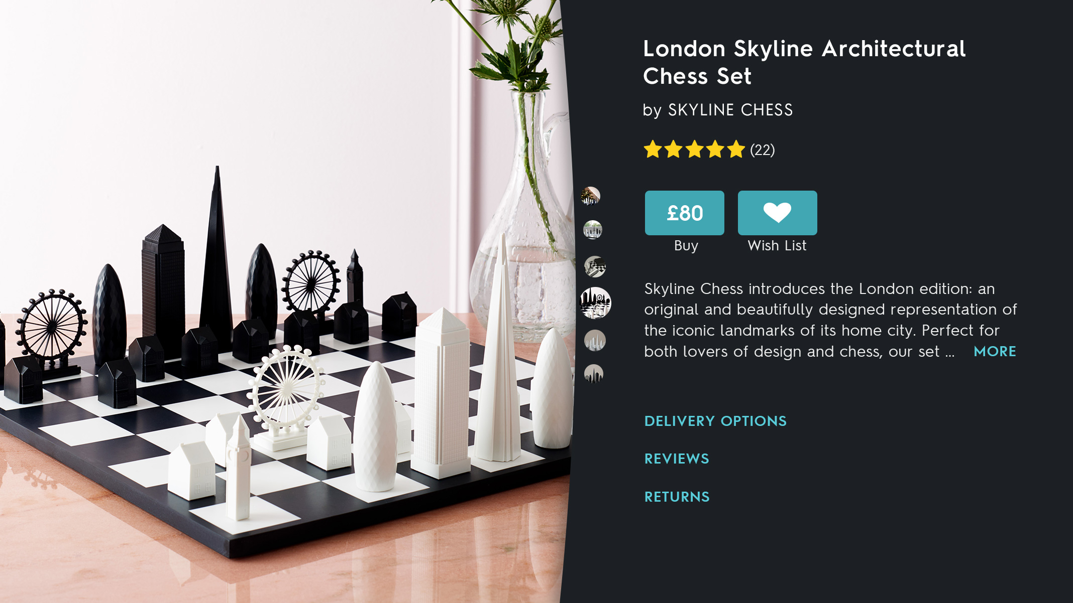
What were the challenges and constraints you experienced whilst building the product page?
"The biggest challenge was that we had a pre-defined deadline, as we wanted to make sure that it was out when the platform was introduced publicly, at the end of October last year. This time restraint made us move very quickly, we got it out the door in time and it did surprisingly well in terms of exposure. Which is what it was all about."
Rob: The product page started out as a design constrained by a few things. The first being that all the images would get sent back to us square - and it’s a rectangular platform. We knew that we had a defined area that we could use and a defined area that we could then use for content. The first thing we did was have a masked fade over the text area and the image, which seemed in line with a lot of platform best practice. That was fine, but not optimal because we thought where would the thumbnails go and where’s the division? Things like that.
The next constraint was trying an angled line, like we do in the app. We tried that and whilst it looked fine as well, it wasn’t perfect. So, we suggested a slightly wackier idea where everything was in circles. That was good but a little bit too far away from the mobile app for comfort and not quite fitting for the images.
Then we redefined the circles and kept the arc. The interesting thing about the arc is that products which have around 30 thumbnail images, you can see that they follow the curve of the arc and scroll along the curve as well. This came out as a great design and then all we had to question was whether it was technically possible.
"We thought, well actually, technically anything is possible. Let’s just do a really good design.”
"This was the most fitting design and it kept the constraints from the square image whilst respecting the UI of the mobile app and being distinctive to the TV. This all came out of the input that all three of us had in the process. It was a very iterative and democratic process."
Keith: Apple really liked it. It was unusual but it also adhered to almost all of their UX guidelines for TV which can be quite constraining and you can feel like everything is templated. If you go to Apple News type apps, they will feel like very similar products apart from stylistically, they’ve got different colour changes and things like that. We wanted to make sure that we were doing something different but still adhered to what they wanted.
-

- Product Page
What did you enjoy most about working with TV?
Rob: It gave us room to explore. Once we’d done this, a UX guy from Apple came in and took a look. We went through the app on various screens and when they landed on the product page they loved it. Which led to them requesting an image they could use on their website. We also took some constructive feedback from that meeting, unearthing other opportunities we could explore.
Changing anything on our business website is huge because the risk is massive. Changing anything in the app is a much lower risk and the great thing about working with changing things in TV is a much lower risk, so we didn’t feel the need to particularly ask for permission to change anything we wanted to in the app.
For example, the ‘wishlist’ section on that page was originally called ‘favourites’, similar to the mobile app. They had some questions like the use of the word favourites and how appropriate that was. We said, “Right, okay, we’re going to go with their suggestion, we're going to go with ‘Wishlist’, which seems a much more reasonable thing. We pulled all the app icons into the designs as well, which are all hand drawn.
Were there any particular aspect of the UX journey you had to tailor for this specific platform?
Rob: The TV app was designed as a pairing for the phone app. If you are going to use the app on TV and you hit the buy button, it’s a complicated process for a few reasons. Largely when buying from us a user generally has to personalise the gift, which is not the experience that you want to give the user on the television. Similarly, users don’t want to enter personal data like credit card information on a massive screen.
"This was an example of what we wanted it to be, not just a functional app but also a second generation TV app."
If you hit that button, what you get is a browser and that says to you, “If you’ve got the Gift Finder app on your iPhone or iPad, open it.” When you open it, your phone will appear and when you click on it, it will send the product to your phone. Then you do your personalisation in an environment that you feel is a bit more appropriate. With the addition of Apple Pay that becomes almost two taps. If it’s a non-customisable product you hit buy, you send it to the phone in the Apple Pay and you’re pretty much done.
At NOTHS, the team have a unique challenge because not only are they talking to customers but also their partners and tailoring an experience suitable for both of them. There have to be mindset changes from left to right to link up these experiences and the tech that runs beneath them. The Apple TV was a recognition of opportunity rather than doing it in the knowledge that it would be a great revenue driver. They tackled their challenges through an iterative approach and democratic environment, optimised for building an app on brand but unique to TV.