
Since placeholders came along, designers have adopted them as means of storing hints. Their appeal lies in their minimal aesthetic and the fact they save space.
"Since placeholders came along, designers have adopted them as means of storing hints."
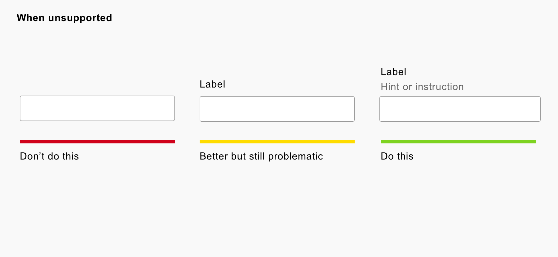
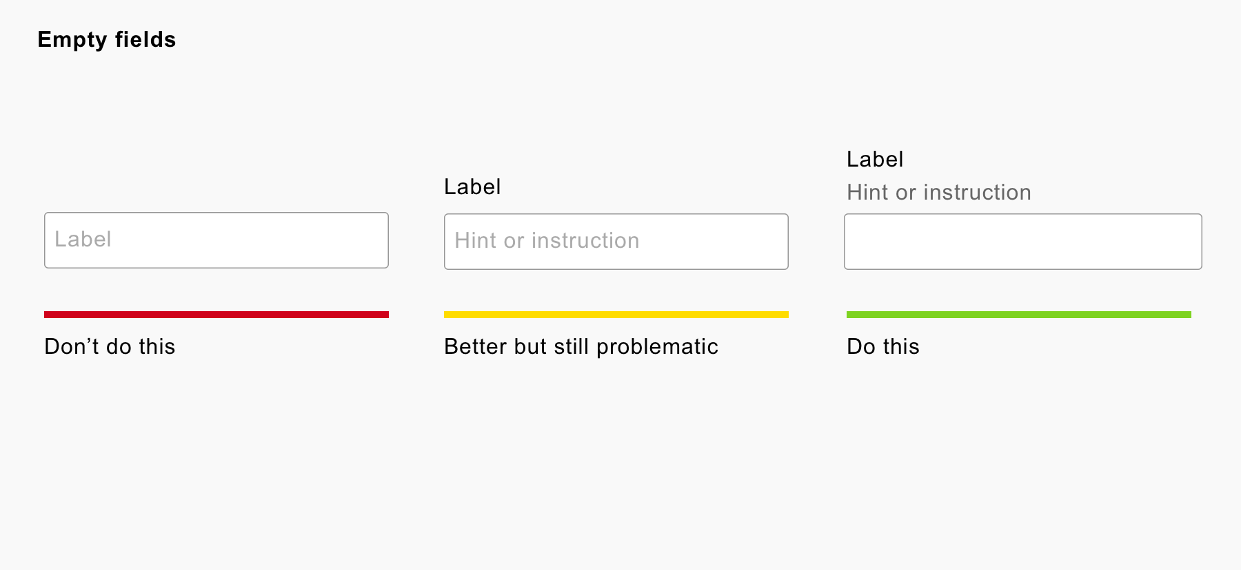
Some designers go one one step further, and replace labels with placeholders. Either way, the placeholder is an Inclusive Design anti-pattern which causes problems for users. Here’s why:
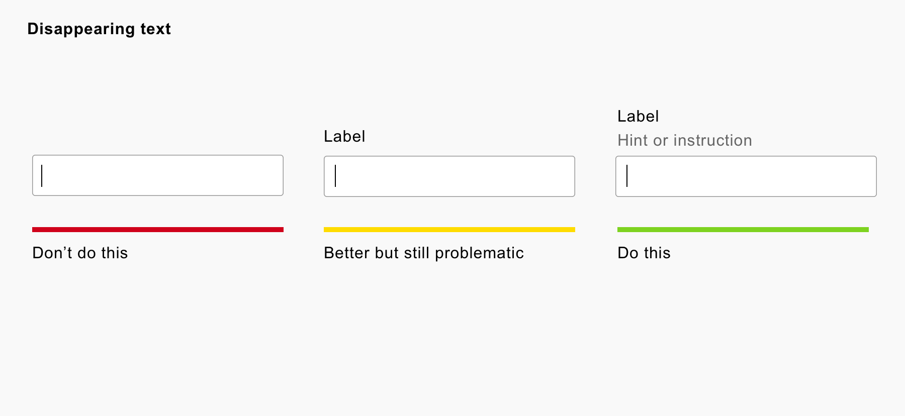
1. It’s easy to forget
The placeholder disappears when the user types. Once it’s gone it’s hard to remember.
-

- Placeholder text disappears as you type
2. Lack of browser support
Not all browsers support the placeholder. In which case, the user will suffer a broken experience.
-

- Broken experience for browsers lacking support
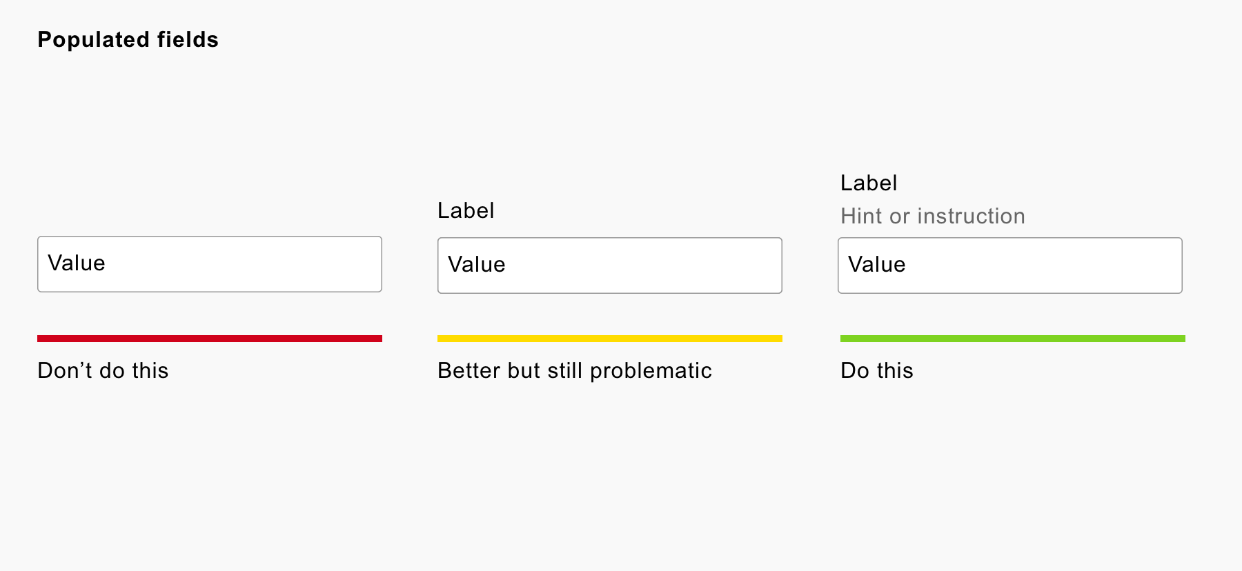
3. Populated values lack clarity
It’s obvious that a missing label is fatal. But if the hint is missing, a user will find it harder to provide an answer.
-

- Populated field are hard to use
4. Reviewing entries before submission is difficult
A user will need to memorise all the hints in order to check their form entries before submission. This is because as each form field is filled out, the hint disappears. The more fields there are the bigger the problem.
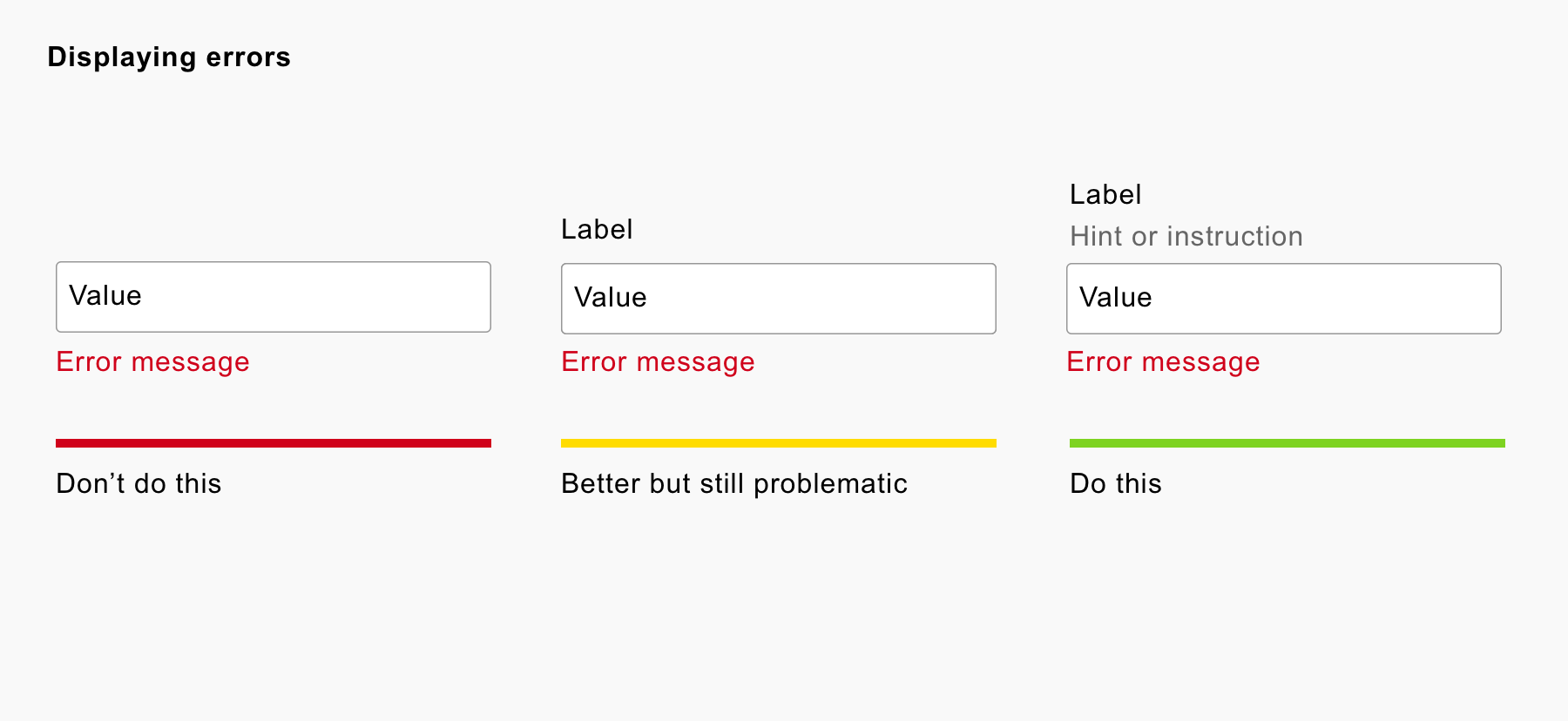
5. Errors are hard to fix
Errors are hard to fix because the message and the value lack context. And the hint may contain information to help fix the error.
-

- Different hint patterns when there are errors
You could write a verbose error message. For example “Your password must be at least 8 characters” instead of “Must be at least 8 characters”. But this doesn’t entirely solve the problem.
6. Some browsers hide the placeholder on focus
Some browsers hide the placeholder when the user focuses, instead of when they start typing. This means the user has to read ahead of the current field to read the hint.
-

- Placeholders disappear on focus
7. Placeholder text may be mistaken for a value
People that don’t notice the subtle difference in contrast will skip the field mistaking it for a value. One test showed that 99% of users thought they didn’t need to enter a value. When the user submits the form they will be frustratingly shown an error.
"One test showed that 99% of users thought they didn’t need to enter a value."
-

- Placeholders might be mistaken for real values
8. They have insufficient contrast
Placeholder text has a lower contrast to help users realise it’s not a value. Some people will struggle to read the text due to the lack of contrast.
9. Screen readers may not announce them
Placeholders may not be read out by screen readers which is the visual equivalent of a blank box.
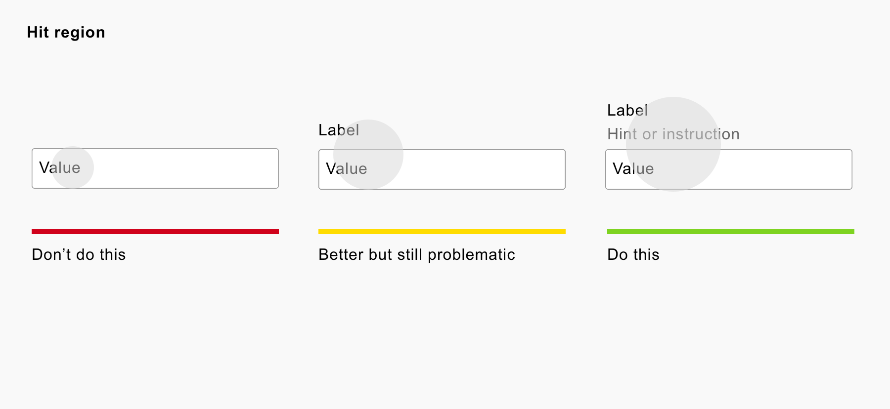
10. The hit area is reduced
Clicking a label moves the focus to the field. This is helpful to everyone but even moreso to people with fine motor skill impairments. Fields with the label and hint outside, increases the size of the hit area.
-

- No label means a smaller hit area.
11. Placeholder text can be cut off
If the placeholder is longer than the size of the field, it will be cut off. This means you’re unnecessarily constrained to what information you can put inside it.
-

- Long text gets cropped

12. Some browsers don’t translate them
For example, when Chrome translates a web page, it will fail to translate the text inside a placeholder.
13. Browser auto-complete exacerbates the problem
The browser’s auto-completion routine populates the fields automatically. This means the placeholder text disappears making it difficult for the user to check the values against what the fields intended.
Summary
"It’s clear—at least in the case of placeholders—that minimal does not mean simple."
Some people ask me if it’s okay to use a placeholder in addition to a label. I say that if the hint is valuable to the user, we should make it easy-to-read and readily accessible. The placeholder doesn’t meet these requirements.
Others say that the placeholder is just an enhancement and not essential to the user. To this I say that if the hint isn’t essential then don’t include it. Content is not an enhancement.
It’s clear—at least in the case of placeholders—that minimal does not mean simple. Avoid placeholders. Always use a label. And, if you do need a hint, place it outside the field.
This post was originally published on Adam's blog.

