Design Doesn’t Scale is a statement that has bothered me for the last four-years. When I joined Spotify’s design team in 2012, the level of inconsistency and fragmentation shocked me. Up-close, the treatment of type, colour, imagery, layout, IA, and interactions just didn’t seem to align anywhere. And when I started talking about it, I realised the whole team was frustrated too.
We concluded that the fragmentation in the product was just reflecting the fragmentation in the team, that designers spread across so many different projects, timezones and competing timetables, just didn’t stand a chance. And, after all, weren’t these factors inherent in all modern tech companies anyway? It was then that I first heard myself say, “Design Doesn’t Scale”.
"We concluded that the fragmentation in the product was just reflecting the fragmentation in the team."
But while this issue unsettled me, I tried my best not to engage with it — dismissing it as a lost cause — and focussing on a redesign instead. It didn’t work. No matter how happy I was with a design, it was always dulled when seen alongside several conflicting design-directions. A year after I joined I finally became so frustrated with this issue that I decided to make it my personal mission to find a solution. Surely crossing the arms and accepting that design doesn’t scale couldn’t be the only answer.
"Crossing arms and accepting that design doesn’t scale couldn’t be the only answer."
And so the premise for my quest was Design Doesn’t Scale or: How does a team of distributed designers, spread across different time-zones, projects and competing objectives ever find a way to work together so they can create one coherent experience? Here’s what we discovered.
Principles
"We decided to write some principles to turn this group of individuals into a team with a shared point-of-view."
It was during a weekly design critique that it became clear we had nothing to align on. Our feedback was nothing more than personal opinions based on some new design fad. This led to frustration for the designer presenting, and left the team with a feeling of uncertainty once the session was over. So in 2013, we decided to write some principles to turn this group of individuals into a team with a shared point-of-view.
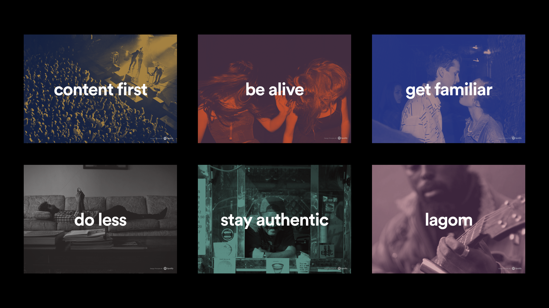
-

- (1) Content First (2) Be Alive (3) Get Familiar (4) Do Less (5) Stay Authentic (6) Lagom
We’ve since used these principles to align our design critiques, shape a collective voice across design in the organisation, and as the foundation for the visual realignment we shipped in 2014 — a project that held many learnings and worthy of its own article.
-

- Spotify 2014 (Project Cat)
What really made the principles work, was that we tailored them to our domain (music) and tied them back to our business goals, in terms that would resonate with non-designers.
Since launching them we’ve been exploring ways to make them stickier, for example, reducing them to three and making them more inclusive as Experience Principles in collaboration with our Marketing team.
Guidelines
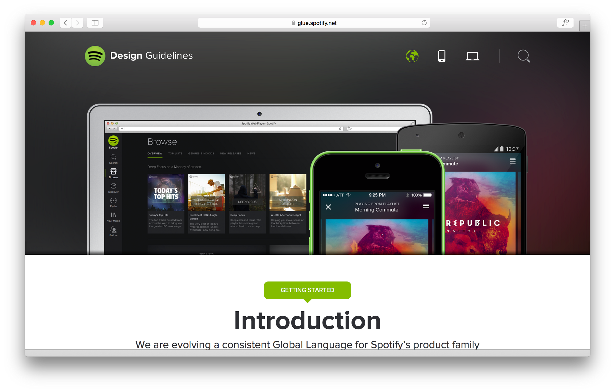
After the visual realignment, it soon became clear that the hardest part would be maintaining this new found consistency. So in 2014, we created Spotify’s Design Language System, GLUE (a Global Language for a Unified Experience), which documented our styles, components, and patterns, on a website that was accessible to everyone in the company.
"Guidelines encouraged consistency, increased efficiency & created a shared vocabulary for designers & developers"
-

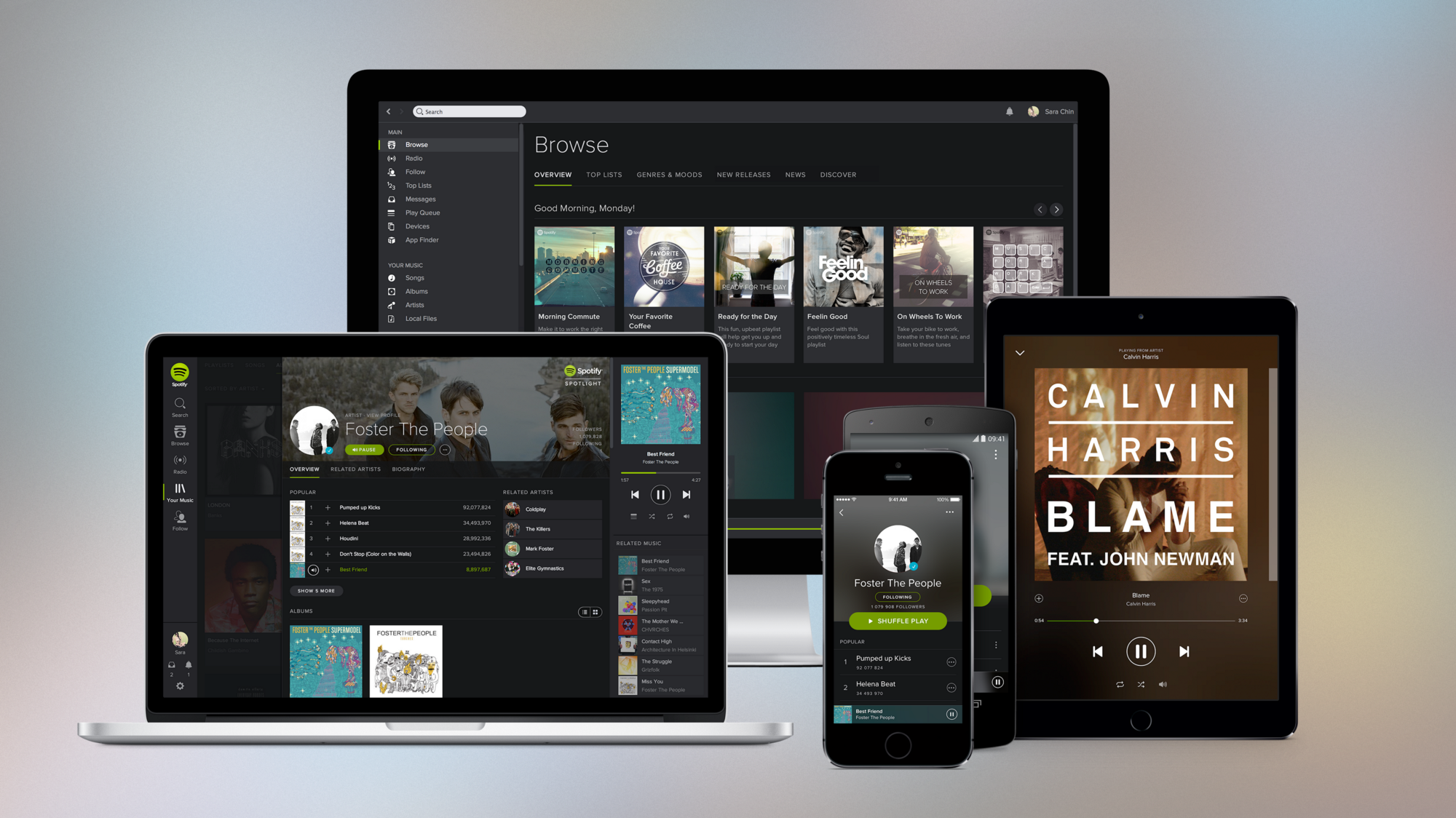
- Version 1 of Spotify’s Guidelines
For the first time we had a shared definition of our interfaces that we could use to coordinate its evolution. This not only encouraged consistency and increased efficiency, but also created a shared vocabulary between designers and developers, so that the label for a colour or type-style could be understood across design-specs and code.
Along with the guidelines, we created UI toolkits for our design tools that reflected the same styles and components. This was great for kickstarting projects, while also highlighting what didn’t exist and might need to be added to the toolkit later. It also forced us to choose which applications (Photoshop or Illustrator or Sketch, etc.) we’d support and how we’d share files with one another.
Modularising design in this way has revealed the relationships and dependencies that make up our experience, and ultimately makes it easier for us to collaborate with one another.
Glue
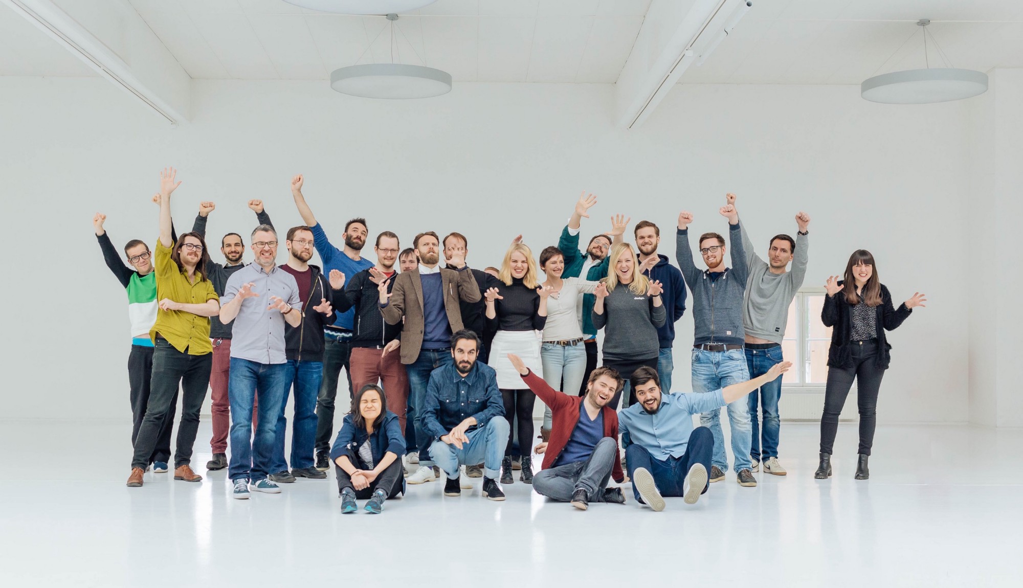
We soon realised that maintaining guidelines and toolkits is a constant effort. So after some convincing, GLUE became a dedicated team in 2015, made up of designers and engineers.
-

- Team GLUE doing a mashup of a T-rex and a Superman pose.
Being a centralised team, GLUE can support our distributed designers by facilitating collaboration across teams and providing frameworks to evolve the different design needs in the company. The engineers on the team extend this work by codifying the core building blocks from the guidelines across iOS, Android and Desktop. Providing a technical implementation for front-end developers across the organisation.
Guild
A common challenge with a central group is maintaining context, as it’s easy to fall out of touch with the current needs of the organisation and find that the solutions you’re providing aren’t relevant anymore. To solve this we setup the Design Guild.
Every week, for 1-hour, two-designers from each product mission and the GLUE team, meet to share context on whatever they’re working on that will have consequence for the others. GLUE might share updates on guidelines, while a feature designer might want to align on a new design they’re working on. Often these updates will result in a friendly-nod to acknowledge we’re aligned, or a workshop to resolve any conflicts in the design direction. This meeting has helped break down silos, encourage collaboration, and amplify a shared sense of ownership for the overall experience.
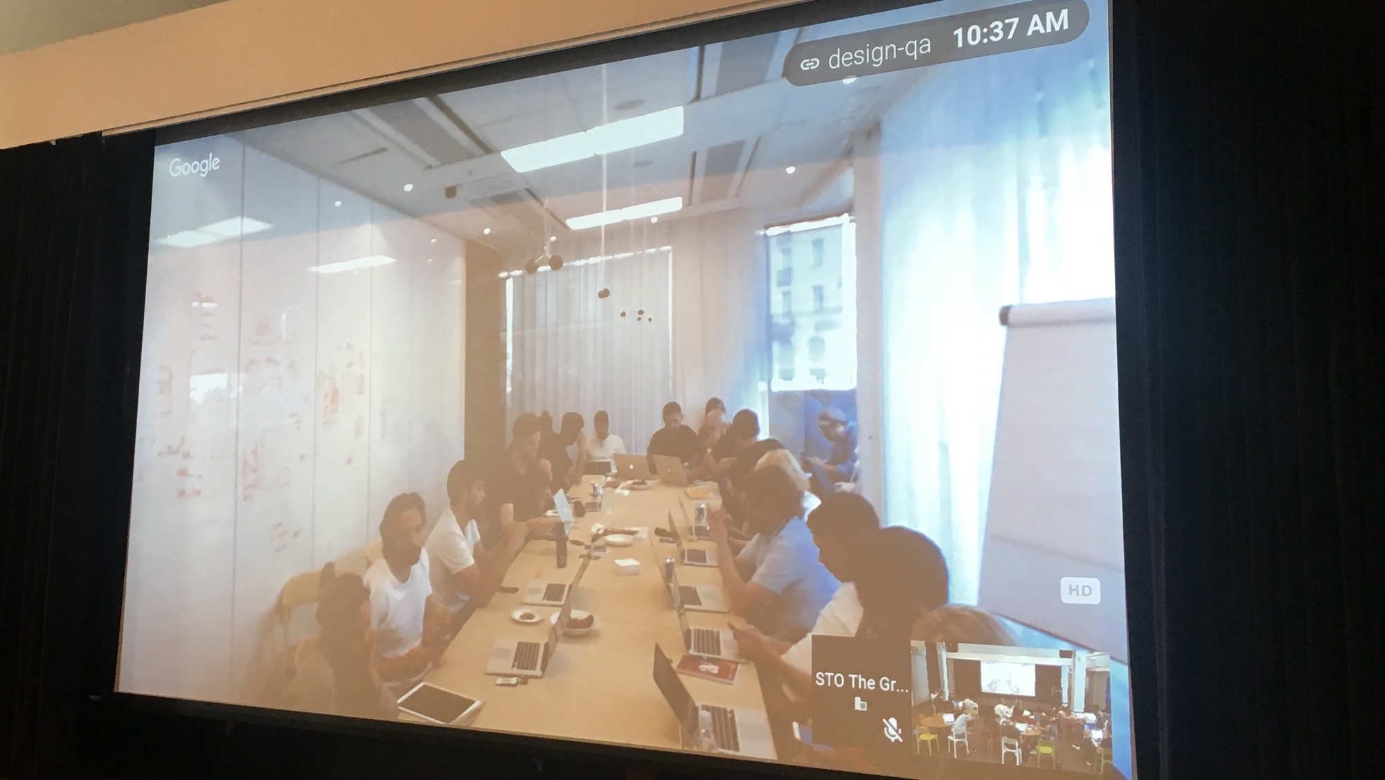
Design QA
Despite all this alignment and coordination, sometimes design bugs still get through. To fix this we recently set-up our first Global Design QA. It required designers from all our offices (Stockholm, Gothenburg, London, New York, and San Francisco) to come together and re-calibrate what our shared definition of quality is, including the practices we need to ensure they are upheld. We invited members of QA (Quality Assurance) to make sure designers were clear on how best to use tools like Jira (a bug ticketing system) and how to test their designs on all supported devices. This triggered many discussions, highlighting concerns from what kind of design bugs should be captured to how to prioritise them.
-

- Snapshot from a recent Design QA workshop.
But perhaps the most fundamental topic we addressed was how we define design quality. Which up until then had been pretty much “you know it when you see it”. We decided to try a checklist instead. In it we stated that quality means following our guidelines and principles, and supporting our core metrics. And that when you need to deviate from either you take accountability for updating any affected teams or frameworks.
"We stated that quality means following our guidelines and principles, and supporting our core metrics."
Looking for more ways to define quality, we recently began asking if a design is “in TUNE”, an acronym to measure all parts of the experience, including how it feels to use Spotify. This is helping to shape a strong narrative around the emotive aspects of our experience, and be mindful that the interface is the brand.
- Tone. Are we using the right kind of tone of voice for our brand?
- Usable. Is it accessible to everyone?
- Necessary. Is that functionality really needed?
- Emotive. Does it feel good to use? Feel like somebody cares?
After the summer, we will trial the Global Design QA process as a key step for any designer preparing to ship something in a release. Making sure that not only will we Design QA our individual work, but all the work that is going live to our customers.
And this brings me back to today. Taking stock of the learnings the last few years have given me and writing this partial account of all the things that have worked for us. And even though I’m aware that this is not a complete journey, that many new challenges will arise, and some solutions might become obsolete, I am happy to put this personal design demon to rest, knowing that when you invest in aligning and co-ordinating designers, design does scale.
"When you invest in aligning and co-ordinating designers, design does scale."
If you’re a designer, product owner or manager, and face any of these challenges, I encourage you to try the methods above and see if they can help. And you can always reach out to me on twitter if you’d like more info or support.
This post was originally published on Stanley's Medium profile.