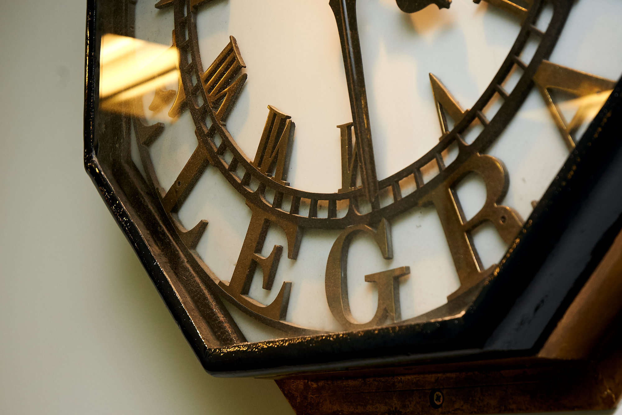
The Telegraph Newspaper. A household name across the country. It’s the number one broadsheet in the UK and is 161 years old and counting. The world wide web fell into receiving arms at The Telegraph, which was the first of its kind to move online in 1994. Now, with circa 90 million uniques a month globally, the paper has turned its sights to mobile.
So how does a newspaper with such legacy design for Generation Now? Joel Wade, Lead Designer, Luke Griffiths, Digital Designer and Chief Customer Officer, Robert Bridge from The Telegraph talk us through the ideation and launch of their new mobile app, carefully designed to bring snappy, visually rich content to its users.
“The core brand values of the business are around perspective, opinion, and analysis. Giving people the content they need to form their own opinion and their perspective on life, ideally helping them progress in life. Those are the sorts of values that are evident in our journalism - it was, is and will be.”
The Telegraph has four products that service their audience: the print product - where it all started; the website, which is both desktop and mobile web; the ‘Edition App’, which replicates the newspaper experience in a digital format, and is predominantly consumed on tablets; and their new mobile app which took six months to build and a cross functional team of 17 people.
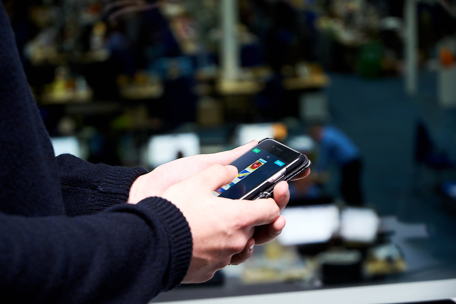
The Telegraph’s new app allows users to consume news on an infinite scroll. Users can select categories they’re most interested in, such as sport, business, entertainment and culture. The experience is refined for each individual user. Every top story features a visual treatment specially designed for the article, called a ‘Bespoke Card’.
What were your initial thoughts before designing the app?
"We were drawn to creating quick, sharp and visual content which enables the user to consume effortlessly."
-

- Luke Griffiths, Product Designer

-

- Joel Wade, Product Designer
Robert explains that the team were drawn to the idea of creating quick, sharp and visual content which enables the user to consume the news in an effortless way, and took forward the idea that a user shouldn’t need to navigate by adding long scrolls. Before building, they asked themselves the following questions to guide their work: What is the value proposition of the app? What are the key user outcomes? What are the key business outcomes? Is it visually engaging?
“Our value proposition was to design an app which was the fastest, easiest and most delightful way to understand what is going on and enjoy the stories that matter to you, through The Telegraph’s fresh, fearless and trustworthy perspective.”
“Before we started on the design we scoped the landscape, looking at other relevant apps to become as informed as possible about the current space,” Joel explains. “As any designer who works within news, it’s common knowledge that everyone is keeping an eye on what everyone else is doing. It's a continuously evolving industry.”
“The news team are actually thinking mobile first now in terms of how they're producing content and how they're working with the design team to produce something that is for mobile.”

When it came to ensuring the newspaper’s authoritative identity was translated into the app. The team thought of it this way:
Jon Hill, Creative Director, always uses the British Museum analogy. “Say you go into the British Museum, you see this really beautiful, historical building which evokes a sense of tradition, respectability and trust. Then you continue walking and arrive at the atrium or courtyard, which has a modern roof extension that could only have been built in the last 15 years or so. He uses that as his approach. The Telegraph masthead, which has been around for 161 years, stands as a beacon of trust, but with modern technology it’s also state of the art and contemporary. We have authority but in everything we do and everywhere you see that mark of authority, it's state of the art, it's contemporary and could only have been done using the most recent technology.”
The Telegraph prides itself on a wealth of legacy in journalism and now they’re ensuring they bring that to a contemporary audience in a digital platform. From a design point of view, this guide helped sharpen what they were doing, what they were thinking about why things like the typeface is important.
The design process

“Our USP is journalism but our USP is also the quality of the products that we produce and design has always been central to the newspaper.”
After several months of research and user testing, the team kicked off designing the app around March this year. Joel and Luke explain that one of the challenges with building this new product was uncovering so many potential routes to follow. “There’s not a one size fits all style or product. It was trying to figure out what our angle was.”
“There’s not a one size fits all style or product."
Initially, the team explored broad concepts regarding what they could do, sketching basic wireframes and building prototypes to support their thinking. The UX, product and tech team were all involved in arranging regular focus groups to review the prototypes and ideas, where they’d also get a chance to speak to the users and refine their ideation. “Right from the start we tried to get ideas onto devices and bring people in to look at them, who could offer a vital external perspective.”
“Once all our initial testing was done, we spent a long time thinking about what would not only be the best thing for The Telegraph but also for our readers. Ultimately, our aim was to build an app that would appeal to our millions of readers and users - but of course with a newspaper you have many different aspects such as advertising and sponsored content that you need to accommodate.”

Nicola Ryan, their Deputy Creative Director, analysed the visual direction they would take, particularly for the bespoke cards. They looked at old magazine and vinyl covers for inspiration on how they could use images, cut-outs and colour. An interesting approach as they identified each of the bespoke cards as being ‘mini-magazine’ covers. “This really helped us sharpen the direction we wanted to take, essential as this is so different to any product we’ve made.”
“Looking at the other platforms out there, differentiating content visually has been a challenge. You only have a fairly small amount of real estate to play with. It’s been a challenge to think of how we bring in the true Telegraph identity into what we produce, always from a journalistic perspective, but also from a design point of view.”
User testing
“Time was best spent creating custom prototypes that were exploratory transitions and ideas."
The team have a room dedicated to user testing, where they bring in both individuals and groups, readers and nonreaders. Luke describes an interesting technique, which involves the team using their contact center as a final focus group to test builds. “Our contact center services our subscription business amongst other things, which is a significant number of people, many of whom are in our target demographic.”
Whilst the team do have an in-house prototyping team, Marvel prototypes were used throughout. The team found that the in-house team’s time was best spent creating custom prototypes that were more exploratory transitions and ideas, whereas conventional prototypes where you plot the flow made more sense in Marvel.
“We’re transitioning towards getting the whole team on Sketch so that we can work with Marvel even faster and test things as quickly as possible. It’s also great for visualising projects to others around the business that aren’t designers.”
Bespoke cards

“The top story cards are one of our biggest features. Three designers will be working on it, day in day out, very closely with the Editors.” During each designer’s shift of working on the bespoke cards, they will be based in the newsroom alongside the journalists. Joel and Luke feel that along with developing closer relationships with the news team, these cards also bring more of a human touch to the app. “Usually, in most new apps, they will have a very automated design.
"Along with developing closer relationships with the news team, these cards bring a human touch to the app."
“We took some cues of where visual design was going for this demographic, in terms of the Instagrams and Snapchats of this world.” Joel explains that, “What’s great about the cards is that you get a brief from an editor about a story and you have got to design it as quickly as possible. Under 10 minutes ideally, which is a huge design challenge, but that’s also what’s nice about it! You get one chance at an idea and you have to run with it. Then, within 20 minutes you see it in an app which thousands of people are using. That’s why I really like this process, because usually in digital design it’s quite a long time before you see a design actually built.”
The language is continuously evolving on the bespoke cards. “We get inspiration from each other. I’ll often look at what Luke did on the shift before or the library of cards we have. Already, we have hundreds - we’re designing at least 30 a day.”
“If a designer joined the team, they’d have a portfolio within two weeks.”
There are guidelines that the team try to follow, for example how they use images and how they use scale. Originally, they were using big images or big cut-outs but realised this was making the stream look repetitive and less inspiring than hoped for. Using scales has really helped the team to make smaller cut-outs which tell a story more than anything else and have identified a set of swatches to use.
-

- Johnny Bedini, Designer
"They learned that as they go on, the human side of this design process is the reactive element."
Initially, they started with a very tight grid with the type and line spacing proportionate to the size of the card, which follows a strict set of colours. From this, they learned that as they go on, the human side of this design process is the reactive element. They established that they need to be more flexible than they originally thought. With things like this constantly being reviewed, the team are accepting that there are certain elements that they will learn as they go.
We have people working in New York and Sydney where there is a smaller team and they don't have a designer. For this, the team’s lead prototyper, Olivier Ramirez, built a tool which allows users to create the cards from a web browser. If a user selects news and then category, it will assign it a theme, a color and they can upload an image. “The process of making the cards is very similar to applying filters on Instagram. It's very easy and they can just download it.”
“When you're designing anything digital for news you haven't got a lot to work with at the eye level. You've got the headline, the meta-data and an image. This has given us an opportunity to build an identity that is quite different from anything else.”
What’s next?
“In terms of new features, we’ve looked at the field and where it’s going and have decided to experiment with bots. Starting with bots for our sports section. So far, we've produced them for Arsenal and Chelsea and a few others. We're never shy about trying new things. We were one of the first publishers on Apple News, and the first to use Facebook articles to try with messenger bots; we were also launch partners on Amazon Echo.”
“We've had a year of redesigning, rebuilding and introducing new products. Now it's a matter of testing, learning, optimising and driving the key metrics around engagement. That's what 2017 is going to be all about. We also have advanced segmentation of our audiences from the data load that we have and we're using that to inform how we optimize and how we iterate our products to really target some of these key segments.”
Download The Telegraph’s new smartphone app for the App or Play store here now.